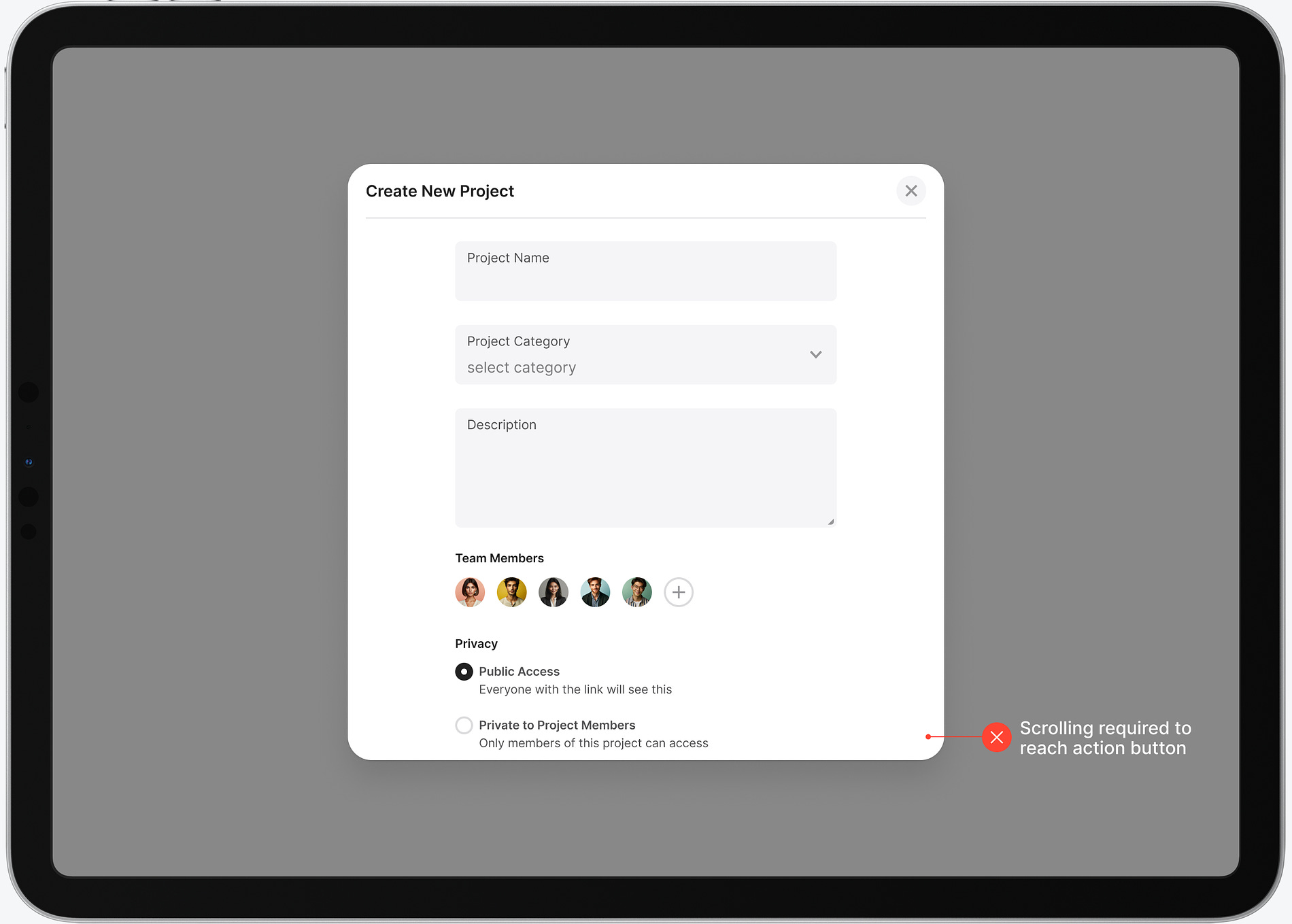
Does your app use too many modal popups? If you use them for more than confirmation dialogs, it does. Many apps will display a modal popup to complete a task flow. However, this common practice leads to a poor user experience on desktop screens. Consider the task flow for creating a new project on an app. When the modal popup displays, not all the elements are in view on the screen. The user must scroll to the bottom to click the action button. This extra work adds more time to the task and decreases efficiency. Continue reading this post for free in the Substack app |
Search thousands of free JavaScript snippets that you can quickly copy and paste into your web pages. Get free JavaScript tutorials, references, code, menus, calendars, popup windows, games, and much more.
Modal Slideouts vs Popups: The Right Choice for Better UX
Subscribe to:
Post Comments (Atom)
When Bad People Make Good Art
I offer six guidelines on cancel culture ͏ ͏ ͏ ͏ ͏ ͏ ͏ ͏ ͏ ͏ ͏ ͏ ͏ ͏ ͏...
-
code.gs // 1. Enter sheet name where data is to be written below var SHEET_NAME = "Sheet1" ; // 2. Run > setup // // 3....


No comments:
Post a Comment