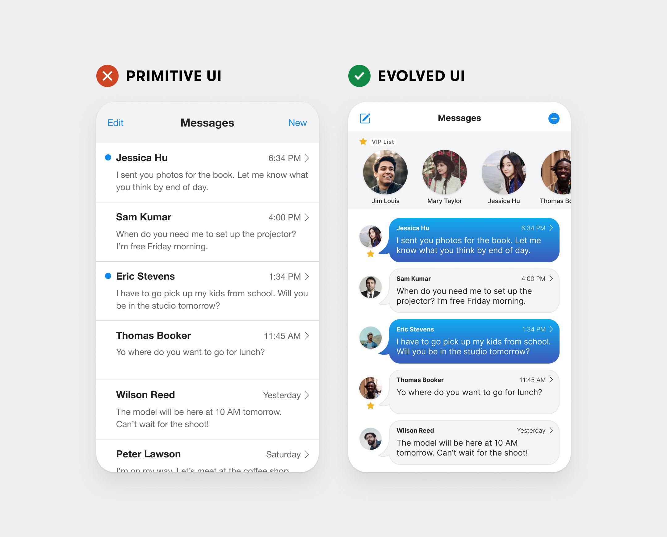
The primitive way to display interface information is to use lines and boxes. This approach usually gets the job done, but something is still mi…
͏ ͏ ͏ ͏ ͏ ͏ ͏ ͏ ͏ ͏ ͏ ͏ ͏ ͏ ͏ ͏ ͏ ͏ ͏ ͏ ͏ ͏ ͏ ͏ ͏ ͏ ͏ ͏ ͏ ͏ ͏ ͏ ͏ ͏ ͏ ͏ ͏ ͏ ͏ ͏ ͏ ͏ ͏ ͏ ͏ ͏ ͏ ͏ ͏ ͏ ͏ ͏ ͏ ͏ ͏ ͏ ͏ ͏ ͏ ͏ ͏ ͏ ͏ ͏ ͏ ͏ ͏ ͏ ͏ ͏ ͏ ͏ ͏ ͏ ͏ ͏ ͏ ͏ ͏ ͏ ͏ ͏ ͏ ͏ ͏ ͏ ͏ ͏ ͏ ͏ ͏ ͏ ͏ ͏ ͏ ͏ ͏ ͏ ͏ ͏ ͏ ͏ ͏ ͏ ͏ ͏ ͏ ͏ ͏ ͏ ͏ ͏ ͏ ͏ ͏ ͏ ͏ ͏ ͏ ͏ ͏ ͏ ͏ ͏ ͏ ͏ ͏ ͏ ͏ ͏ ͏ ͏ ͏ ͏ ͏ ͏ ͏ ͏ ͏ ͏ ͏ ͏ ͏ ͏ ͏ ͏ ͏ ͏ ͏ ͏ ͏ ͏ ͏ ͏ ͏ ͏ ͏ ͏ ͏ ͏ ͏ ͏ ͏ ͏ ͏ ͏ ͏ ͏ ͏ ͏ ͏ ͏ ͏ ͏ ͏ ͏ ͏ ͏ ͏ ͏ ͏ ͏ ͏ ͏ ͏ ͏ ͏ ͏ ͏ ͏ ͏ ͏ ͏ ͏ ͏ ͏ ͏ ͏ ͏ ͏
| | |
| | | | The primitive way to display interface information is to use lines and boxes. This approach usually gets the job done, but something is still missing. Such a primitive UI feels dull, flat, and rudimentary. Is this the best user experience one can design? Designers should aim for an evolved UI beyond simple lines and boxes. The messages app brings the messaging motif into the UI by using message bubbles, and avatar faces to display the data. As a result, users can recognize the nature of the information at a glance. Rather than displaying information in a list, the app prioritizes the data based on the user’s needs. For instance, it allows users to create a VIP list to find a person’s messages immediately rather than scrolling through the entire list. The primitive UI looks and feels underdeveloped and unfinished, while the evolved UI looks and feels more like a complete messaging app at its peak stage. What are your thoughts on this new way of thinking? |
| | |
|
| |


No comments:
Post a Comment