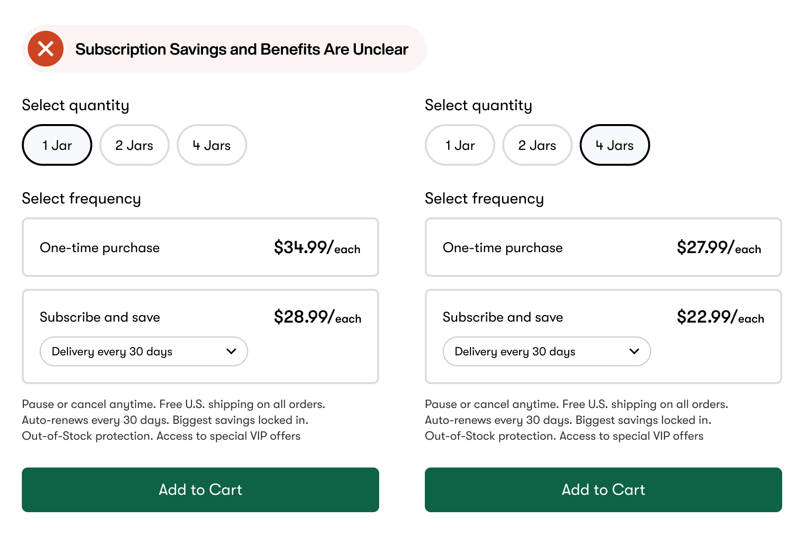
The subscription model is gaining significant momentum in the market. This prevalence in the industry means a user-friendly subscription box interface is more critical for sales than ever. However, many complexities are involved, such as displaying subscription prices, savings, and benefits. This article will show you how to design a subscription box selector that encourages users to choose a plan and subscribe. The two main obstacles that create friction for subscription boxes are:
This example demonstrates how the price decreases when users select more products. However, it doesn't make it clear how much they can save. Not only that, but the benefits of subscribing are also unclear. The text at the bottom describes the features but is hard to notice and read. When users cannot perceive the savings and benefits of your subscription, they lack the motivation to subscribe. You need to incentivize them to subscribe by clarifying the benefits and savings in your design...  Continue reading this post for free, courtesy of Anthony.A subscription gets you:
|
Search thousands of free JavaScript snippets that you can quickly copy and paste into your web pages. Get free JavaScript tutorials, references, code, menus, calendars, popup windows, games, and much more.
A Better UI Design for Subscription Box Selectors
Subscribe to:
Post Comments (Atom)
I Quit AeroMedLab
Watch now (2 mins) | Today is my last day at AeroMedLab ͏ ͏ ͏ ͏ ͏ ͏ ͏ ͏ ͏ ͏ ͏ ͏ ...
-
code.gs // 1. Enter sheet name where data is to be written below var SHEET_NAME = "Sheet1" ; // 2. Run > setup // // 3....

No comments:
Post a Comment