Why Is the Tesla Cybertruck So Depressingly Ugly?It's a bigger problem than just one sinister-looking carFrench writer Guy de Maupassant hated the Eiffel Tower. He thought it looked like an ugly iron skeleton. But he allegedly traveled to the Eiffel Tower almost every day, and ate lunch at its base. What a strange contradiction! When asked why, he explained that this was “the only place in the city where I won't see it.” I apply the same logic to the Tesla Cybertruck. The only justification for driving this vehicle is that you won’t have to look at it once you get inside. Back in June, I complained about the “banishment of beauty from everyday life.” I griped about the degradation of aesthetics and design—and gave many examples, covering everything from household appliances to sewer covers. I asked why we can’t have nice things—like these vintage Japanese train tickets.
Or consider this Tesla Radio logo from 1921. (Yes, Tesla—the irony is not lost on me—but it’s a different company.)
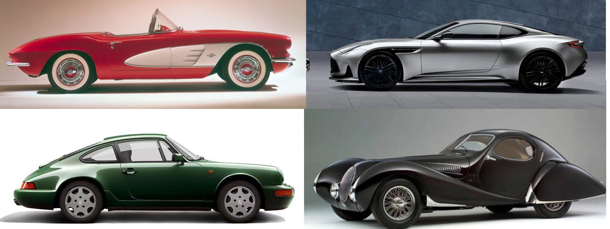
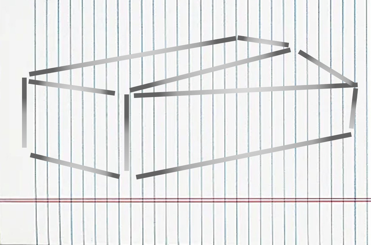
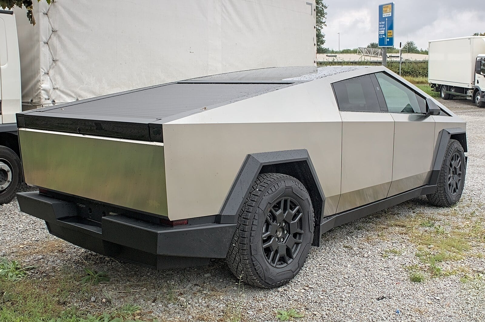
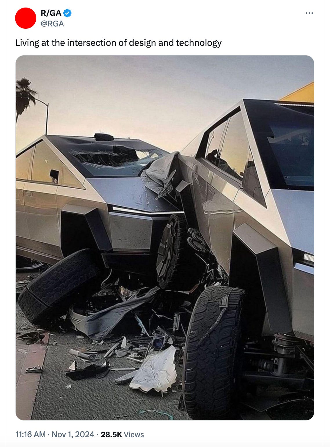
But I didn’t really grasp the depths of contemporary ugliness until I saw a Tesla Cybertruck roaring through my neighborhood, like some kind of militia tank for an imminent civil war. I scorn it the way Maupassant dissed the Eiffel Tower—but I also learn from this bad boy. That’s because, for better or worse, the Cybertruck tells us much about the corruption of aesthetics in out time. If you want to support my work, consider taking out a premium subscription—for just $6 per month (even less if you sign up for a year).I’m now quite familiar with this motorized monstrosity—these nightmares from a high school metal shop are everywhere I go. And they make all the infernal examples I gave in my previous article seem like mere trifles compared to this battery-powered hell on wheels. When I see the pleasing car designs from the past, the first word that comes to mind is curvilinear. It’s as if the goddess of advanced geometry inspired their birth, mixing straight and round in intoxicating new ways. But the Cybertruck looks like it was designed by a third grader with a pen and ruler—who spent about three minutes drawing straight lines on the back of a homework assignment. What is it? Maybe a shipping crate? A garbage dumpster? A coffin from Dracula’s castle? No, it’s a $100,000 vehicle.
This eyesore is manufactured not far from my Austin home and private hermitage—in a place called Gigafactory Texas. That discordant name is like the beastly vehicle itself, conveying pomposity and fatuity in equal doses. But when I see these vehicles barrelling down the road, I’m reminded of a Texas saying—applied to newcomers who strut like cowboys but without any real cowpoking skills to back it up. “All hat and no cattle.” And that pretty much sums up product design as practiced in Gigafactory Texas. But this is not a rant. Or perhaps I should say: This is more than just a rant. The Cybertruck reveals the dark side of contemporary aesthetics, and similar abominations are on the ascendancy all over the world—not just in Gigafactory Texas. If we understand why this vehicle looks so brutal, it will help us grasp so much else happening today.
The great critic John Ruskin claimed—persuasively, I believe—that the human element in art is most clearly seen in attention to nuances and details. That’s why he loved Gothic architecture with all its curlicues and ornamentations. Or consider the softened curvilinear design of the Sagrada Família in Barcelona, one of the most emotionally impactful works of architecture produced in modern times. Its visionary designer Antoni Gaudi, who was influenced by neo-Gothic architecture, explained that “the straight line belongs to men, the curved one to God.”
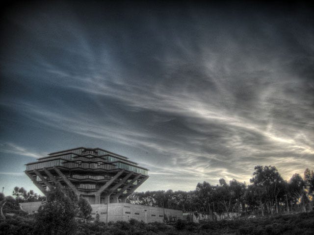
Gaudi sought inspiration from plant life—and he studied vines, seaweed, oleanders, and other examples of effortless design in the natural world. “Nothing is art if it does not come from nature,” he declared. It’s precisely this natural quality that gets erased in the Cybertruck. The new Tesla embodies design without nuance or subtlety or any humanizing elements whatsoever. It has about as much emotional warmth as a battering ram or a piece of sheet metal—both of which it resembles, by the way. But here’s the key point—the Cybertruck replaces beauty with power. This car wants to look intimidating to outsiders, like a bully strutting on the playground. That’s the entire goal of its design. A comparison with Brutalist architecture is inevitable. Brutalism has its fans, and they pretend to find something aesthetically pleasing in these imposing concrete blocks. But that totally misrepresents what Brutalism actually intends. Like the Cybertruck, Brutalism is all about power, not beauty. Related reading:The Most Dangerous Thing in the Culture Right Now Is BeautyThe Banishment of Beauty from Everyday LifeMy Alternative Tech Canon—26 Mind-Expanding BooksI still recall arriving on my college campus as a homesick freshman, and how I took solace in the comforting appearance of the old buildings. They were softened by adobe and red tiles and other inviting ingredients drawn from local traditions and materials. But one of the newest buildings on campus stood out for its coldness and ugliness. This building was massive, and looked like a bunker where war criminals might hide after nuclear fallout. Windows had been eliminated, except for the front entrance, and the body of the building consisted of rough-hewn rock of immense thickness. “Why did they make this building so ugly?” I asked an older student. “They designed this building during a period of student protests and riots,” he explained. “The administration wanted to send a message to the students: We’re more powerful than you.” You can huff and puff all you want, but you won’t blow this building down! I found it ironic that this deadening building was the campus’s new “center for educational research.” What a sad way of researching education! Other institutional buildings from that era convey the same idea—we’re up, and you’re down. When I wrote my books Work Songs and Healing Songs, I lived in San Diego, and the best library near my home was this famously ugly building.
I went there day after day—I really had no choice. But I always shuddered as I approached this visual symbol for domination and control. This is actually the first building that shows up when I do a Google search for “Brutalist architecture.” And it’s the very same place where I did my career-defining research into the human qualities in artistic creativity. Maybe my books were a way of rebelling against the building where I worked on them. The irony is that this ugly library was named after Dr. Seuss—whose books I had loved as a child. But this building was even less appealing than green eggs and ham. That’s the Brutalist aesthetic in a nutshell. People who wax nostalgically over these ugly buildings nowadays miss the point entirely. We were never supposed to love them—that would have defeated the whole purpose in erecting them. Fear and disempowerment are the intended results. And that, my friends, is the real purpose of the Tesla Cybertruck design— it’s fear and loathing time in Gigafactory Texas. Only the person driving the vehicle gets to feel powerful. Everybody else is just cannon fodder.
I suspect that’s why it’s so hard to get insurance for these cars. The kind of person who drives an over-the-top Napoleonic vehicle of this sort isn’t going to hit the brakes unless absolutely necessary. If this were just a matter of one ugly car and some old Brutalist buildings, I wouldn’t waste time with such ineffectual ranting. But the fondness for both these visual atrocities in the current moment is revealing. Raw assertions of power are everywhere in our culture—and arts and creativity are inescapably poisoned by them. I touched on this in a recent article entitled “How Did Pop Culture Get So Gloomy?” I talked about the huge current-day popularity of horror films in that essay. But if I was making a bloody slasher film of this sort, I’d negotiate a product placement deal with Tesla. The Cybertruck is the perfect vehicle for a zombie apocalypse. It would make a great movie. I can just imagine a Cybertruck mowing down a gang of undead assailants. But it’s not-so-great in real life, or in my zombie-free neighborhood. I take some comfort in knowing that this phase in aesthetics will pass. Even the Cybertruck will lose its luster. (I’m told that stainless steel starts to rust after about six months.) Gloominess will eventually run its course, and the cycle will turn back to actual beauty, with all its nuances, subtleties, and human qualities. I plan on getting a head start on the beauty revival. I’m certainly not waiting for the folks in Gigafactory Texas to get a clue. But, sooner or later, even they might want to rejoin the living. You're currently a free subscriber to The Honest Broker. For the full experience, upgrade your subscription. |
Search thousands of free JavaScript snippets that you can quickly copy and paste into your web pages. Get free JavaScript tutorials, references, code, menus, calendars, popup windows, games, and much more.
Why Is the Tesla Cybertruck So Depressingly Ugly?
Subscribe to:
Post Comments (Atom)
Top 3 UX Design Articles of 2024 to Remember
Based on most subscriptions ͏ ͏ ͏ ͏ ͏ ͏ ͏ ͏ ͏ ͏ ͏ ͏ ͏ ͏ ͏ ͏ ...
-
code.gs // 1. Enter sheet name where data is to be written below var SHEET_NAME = "Sheet1" ; // 2. Run > setup // // 3....



No comments:
Post a Comment