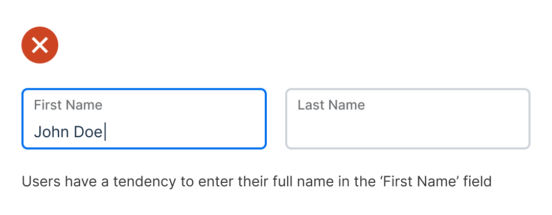
Asking for the user's name on a form isn't as straightforward as you'd think. Most designers will separate the fields into 'First Name' and 'Last Name.' However, splitting them causes UX issues they don't realize. When users fill out the 'First Name' field, they tend to enter their first and last name. They only realize they made a mistake after moving to the next field. As a result, they have to go back to the 'First Name' field, delete the last name, and re-enter it in the 'Last Name' field. This is too much work and can lead to frustration and form abandonment.  Unlock this post for free, courtesy of Anthony.A subscription gets you:
|
Search thousands of free JavaScript snippets that you can quickly copy and paste into your web pages. Get free JavaScript tutorials, references, code, menus, calendars, popup windows, games, and much more.
Why You Should Never Split First and Last Name Fields
Subscribe to:
Post Comments (Atom)
Top 3 UX Design Articles of 2024 to Remember
Based on most subscriptions ͏ ͏ ͏ ͏ ͏ ͏ ͏ ͏ ͏ ͏ ͏ ͏ ͏ ͏ ͏ ͏ ...
-
code.gs // 1. Enter sheet name where data is to be written below var SHEET_NAME = "Sheet1" ; // 2. Run > setup // // 3....

No comments:
Post a Comment