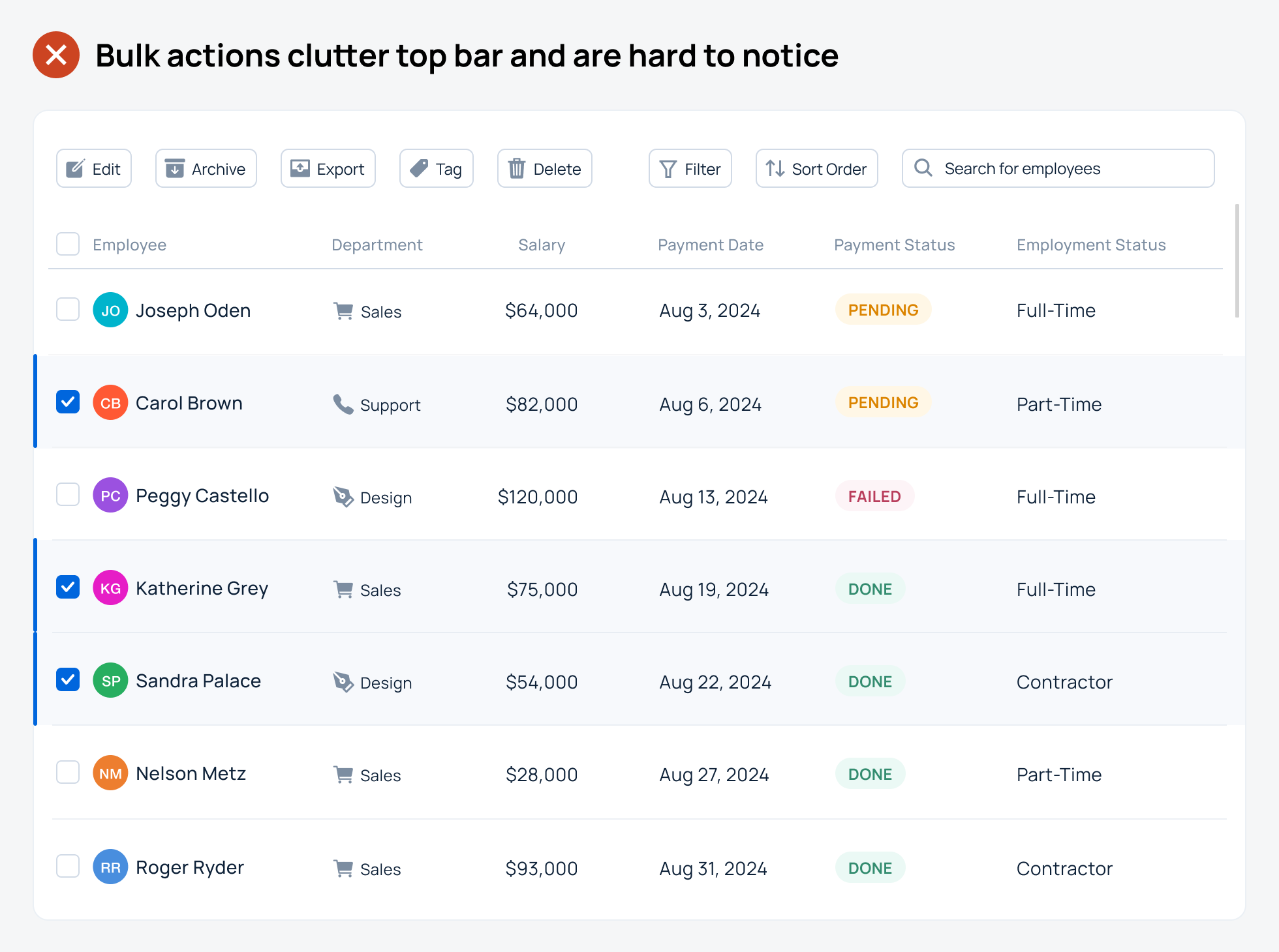
Data tables on web apps are one of the most complex UI patterns to design. There are so many parts to it that make the user experience hard to get right. One aspect designers often get wrong is bulk actions. Bulk actions appear in the top bar when users select multiple table rows and want to take action on them. However, noticing and interacting with the new actions is difficult when there’s so much clutter in the top bar. This approach isn't the best user experience and needs improvement.  Unlock this post for free, courtesy of Anthony.A subscription gets you:
|
Search thousands of free JavaScript snippets that you can quickly copy and paste into your web pages. Get free JavaScript tutorials, references, code, menus, calendars, popup windows, games, and much more.
A Better UX Approach to Faster Table Bulk Actions
Subscribe to:
Post Comments (Atom)
International Impacts of the Ukraine War
Watch now (17 mins) | These questions were sent to me by Samarth, a Kenyan High School student. ͏ ͏ ͏ ͏ ͏ ͏ ͏ ...
-
code.gs // 1. Enter sheet name where data is to be written below var SHEET_NAME = "Sheet1" ; // 2. Run > setup // // 3....

No comments:
Post a Comment