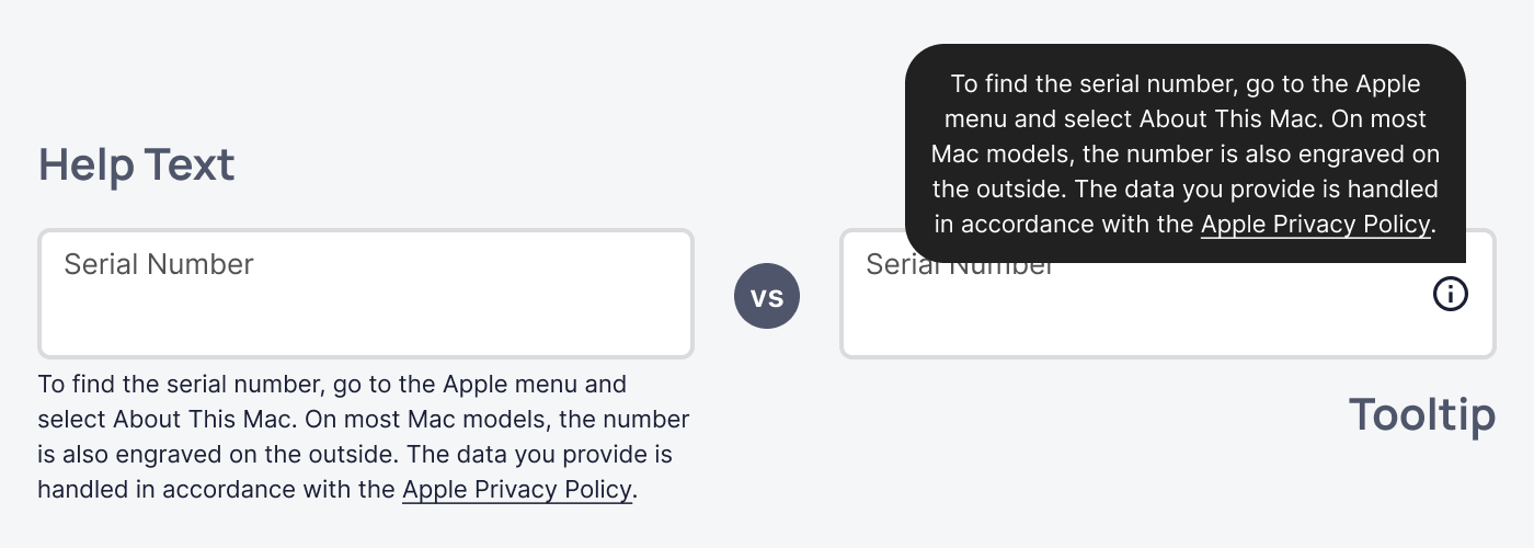
A label isn't always enough to explain a complex form field to users. They may have other looming questions that prevent them from entering their information. It's up to you to provide context to ambiguous fields using help text or tooltips. However, designers often wonder whether help text or tooltips are better for the user experience. The key is to understand when to use which so you can make the right decision for your form.  Continue reading this post for freeThis post is visible to paid subscribers only, but you can unlock one paid post, courtesy of Anthony. A subscription gets you:
|
Search thousands of free JavaScript snippets that you can quickly copy and paste into your web pages. Get free JavaScript tutorials, references, code, menus, calendars, popup windows, games, and much more.
Help Text vs Tooltips: Which Is Better for Forms
Subscribe to:
Post Comments (Atom)
When Bad People Make Good Art
I offer six guidelines on cancel culture ͏ ͏ ͏ ͏ ͏ ͏ ͏ ͏ ͏ ͏ ͏ ͏ ͏ ͏ ͏...
-
code.gs // 1. Enter sheet name where data is to be written below var SHEET_NAME = "Sheet1" ; // 2. Run > setup // // 3....

No comments:
Post a Comment