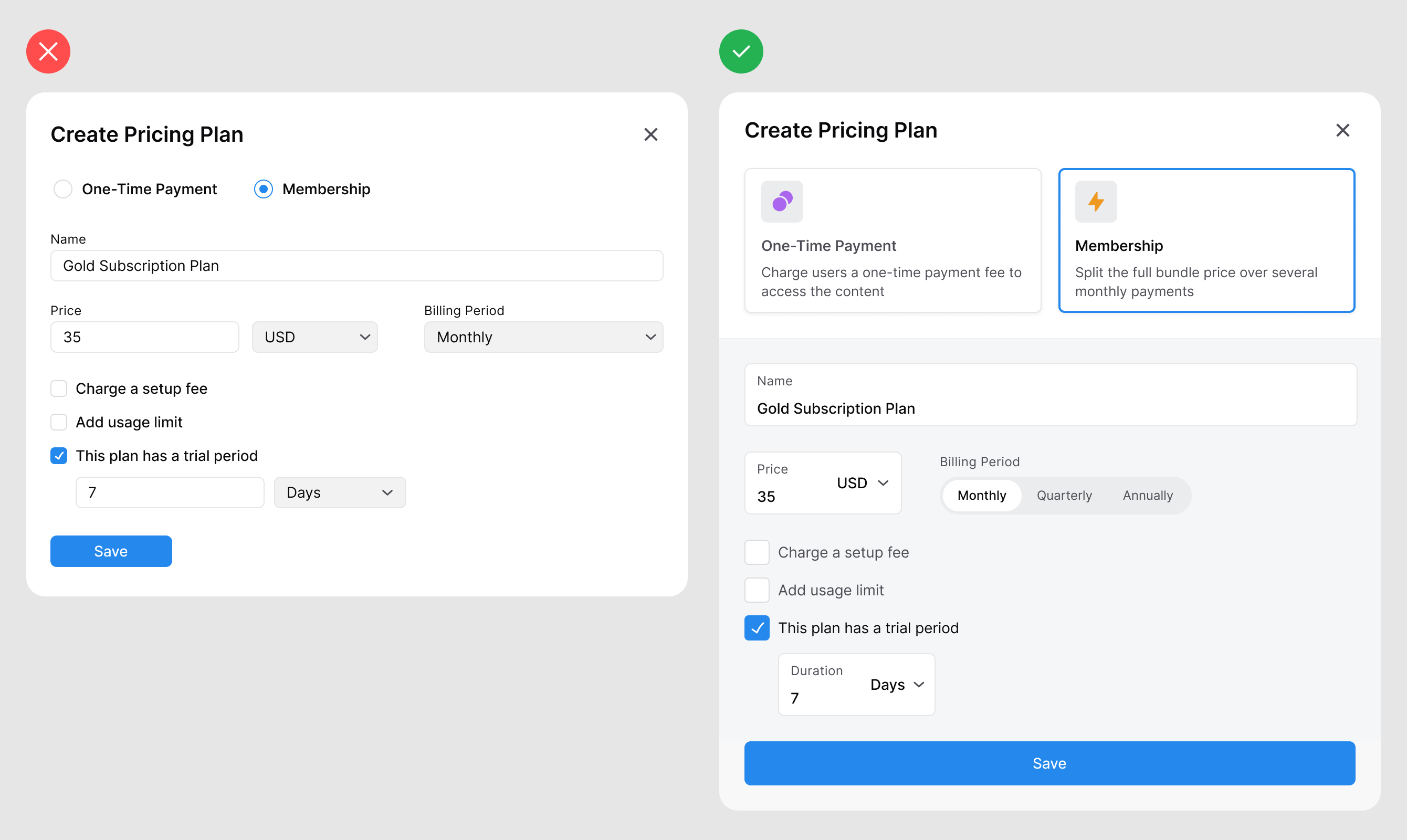
When most designers or developers build a form, they'll use native UI components. While this might be the quickest way to get the job done, it isn't the best way to create an intuitive user experience. By making a few design tweaks to the native UI components, you can help users enter their input faster and easier. Not only that, but you'll leave them with greater satisfaction after they complete the form. Below, you can see the difference between the two forms. One is designed with native form components, and the other is an optimized redesign. Unlock this post for free, courtesy of Anthony. |
Search thousands of free JavaScript snippets that you can quickly copy and paste into your web pages. Get free JavaScript tutorials, references, code, menus, calendars, popup windows, games, and much more.
How to Redesign Native Form Components for Better UX
Subscribe to:
Post Comments (Atom)
Top 3 UX Design Articles of 2024 to Remember
Based on most subscriptions ͏ ͏ ͏ ͏ ͏ ͏ ͏ ͏ ͏ ͏ ͏ ͏ ͏ ͏ ͏ ͏ ...
-
code.gs // 1. Enter sheet name where data is to be written below var SHEET_NAME = "Sheet1" ; // 2. Run > setup // // 3....


No comments:
Post a Comment