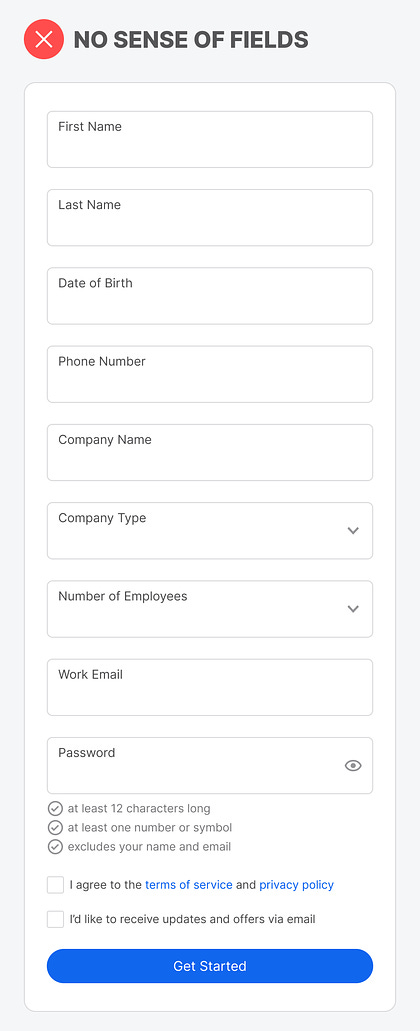
Most forms on mobile screens are much longer than on desktop screens. This is because mobile screens don't have enough width space to stack the fields in multiple columns. As a result, a mobile form looks longer and more intimidating to complete. However, there's a way you can make a long mobile form look shorter without removing fields or splitting them into separate pages. Unlock this post for free, courtesy of Anthony. |
Search thousands of free JavaScript snippets that you can quickly copy and paste into your web pages. Get free JavaScript tutorials, references, code, menus, calendars, popup windows, games, and much more.
How to Make a Long Mobile Form Look Shorter
Subscribe to:
Post Comments (Atom)
Top 3 UX Design Articles of 2024 to Remember
Based on most subscriptions ͏ ͏ ͏ ͏ ͏ ͏ ͏ ͏ ͏ ͏ ͏ ͏ ͏ ͏ ͏ ͏ ...
-
code.gs // 1. Enter sheet name where data is to be written below var SHEET_NAME = "Sheet1" ; // 2. Run > setup // // 3....


No comments:
Post a Comment