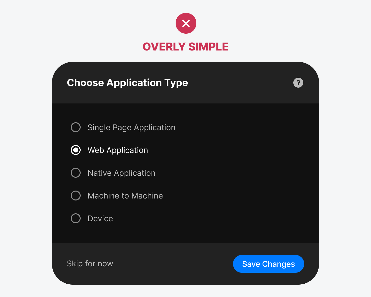
Most designers follow the adage "less is more" when designing. Aiming for simplicity usually creates better user experiences. However, sometimes less isn't enough, and users need much more. Interfaces that are too simple can often confuse users. The example below presents several options not every user understands with a text label alone. It looks clean and minimalist, but it's missing some context. As a result, users can't differentiate the options to make the best choice. Continue reading this post for free in the Substack app |
Search thousands of free JavaScript snippets that you can quickly copy and paste into your web pages. Get free JavaScript tutorials, references, code, menus, calendars, popup windows, games, and much more.
When Simple Interfaces Are a Bad User Experience
Subscribe to:
Post Comments (Atom)
Inside Gong: How teams work with design partners, their pod structure, autonomy, trust, and more | Eilon Reshef (c…
Gong CPO Eilon Reshef on their unique team pod structure, how pods work with design partners, his spiral method for mastering complex topics...
-
code.gs // 1. Enter sheet name where data is to be written below var SHEET_NAME = "Sheet1" ; // 2. Run > setup // // 3....


No comments:
Post a Comment