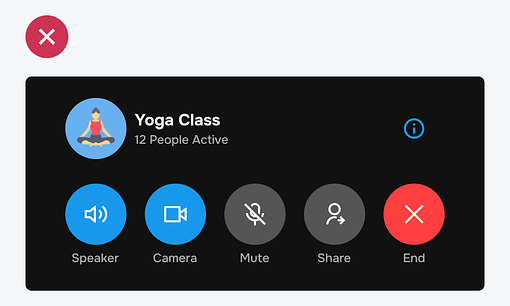
The biggest UX problem with toggle button design is state ambiguity. No matter what designers do, users never know whether a toggle is on or off. The reason for this is the sole use of color to differentiate the states. Designers often use color to signify active toggle buttons. However, this creates confusion if it competes with other elements of the same color. The example shows blue toggle buttons with other blue elements on the screen. It's unclear whether the blue indicates a binary state or regular action buttons. In addition, the blue buttons also compete with other buttons that have color, such as the red button. There's so much visual noise that it's hard for users to process the interface cognitively. Continue reading this post for free in the Substack app |
Search thousands of free JavaScript snippets that you can quickly copy and paste into your web pages. Get free JavaScript tutorials, references, code, menus, calendars, popup windows, games, and much more.
How to Signify Toggle Button States Without Color
Subscribe to:
Post Comments (Atom)
Shipping projects at Big Tech with Sean Goedecke
In today’s episode of The Pragmatic Engineer, I’m joined by Sean Goedecke, Staff Software Engineer at GitHub. ͏ ͏ ͏ ͏ ͏ ...
-
code.gs // 1. Enter sheet name where data is to be written below var SHEET_NAME = "Sheet1" ; // 2. Run > setup // // 3....


No comments:
Post a Comment