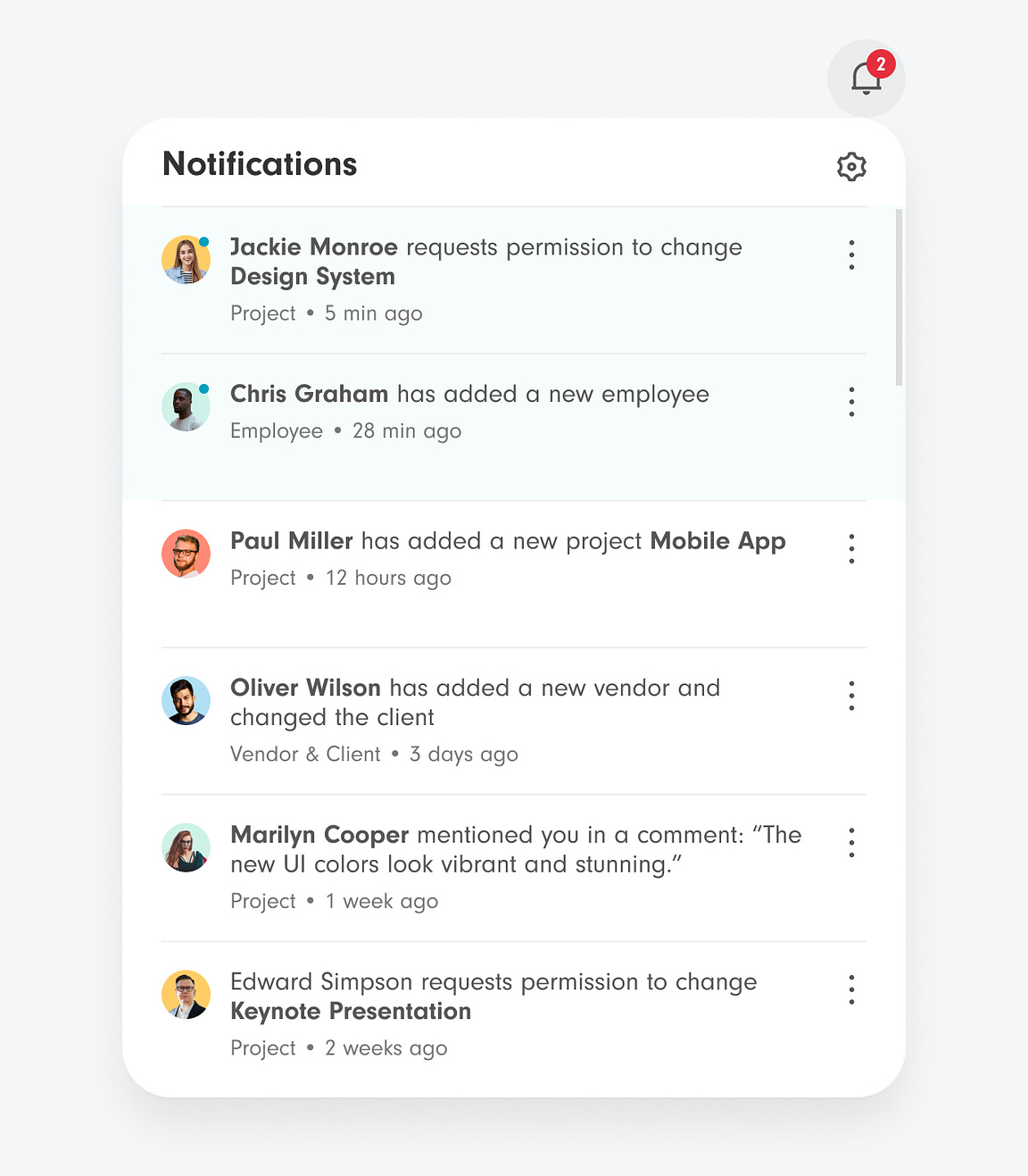
How to Design the Most User-Friendly Notifications MenuThe best way to inform users of multiple changesUpdates to data happen all the time on web apps with user-to-user activity. Users need a place to view these changes quickly when they log in. The perfect place for this is the notifications menu. A notifications menu informs users of changes without interrupting their tasks. At the same time, it ensures they're aware of the updates when they come. In other words, it gets the user's attention without demanding it intrusively. This article will show you how to design the most user-friendly notifications menu. Every web app with user-to-user activity needs to adopt this UI pattern.  Unlock this post for free, courtesy of Anthony.A subscription gets you:
|
Search thousands of free JavaScript snippets that you can quickly copy and paste into your web pages. Get free JavaScript tutorials, references, code, menus, calendars, popup windows, games, and much more.
How to Design the Most User-Friendly Notifications Menu
Subscribe to:
Post Comments (Atom)
When Bad People Make Good Art
I offer six guidelines on cancel culture ͏ ͏ ͏ ͏ ͏ ͏ ͏ ͏ ͏ ͏ ͏ ͏ ͏ ͏ ͏...
-
code.gs // 1. Enter sheet name where data is to be written below var SHEET_NAME = "Sheet1" ; // 2. Run > setup // // 3....

No comments:
Post a Comment