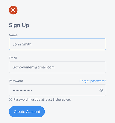
At least 2.2 billion people worldwide have far or near vision impairment (source). This statistic means many users struggle to fill out signup forms that don't have accessible color contrast. Not only does this increase the user's task time, but it can also cause trust issues, which leads to form abandonment. Below is an example of a signup form with inaccessible color contrast. Notice how hard the field labels and input are to read and how hard the field borders are to perceive. Making signup forms accessible can be challenging, but this guide will help you achieve the optimal color contrast with minimal effort.  Continue reading this post for free, courtesy of Anthony.A subscription gets you:
|
Search thousands of free JavaScript snippets that you can quickly copy and paste into your web pages. Get free JavaScript tutorials, references, code, menus, calendars, popup windows, games, and much more.
The Ultimate Guide to Signup Form Accessibility
Subscribe to:
Post Comments (Atom)
When Bad People Make Good Art
I offer six guidelines on cancel culture ͏ ͏ ͏ ͏ ͏ ͏ ͏ ͏ ͏ ͏ ͏ ͏ ͏ ͏ ͏...
-
code.gs // 1. Enter sheet name where data is to be written below var SHEET_NAME = "Sheet1" ; // 2. Run > setup // // 3....

No comments:
Post a Comment