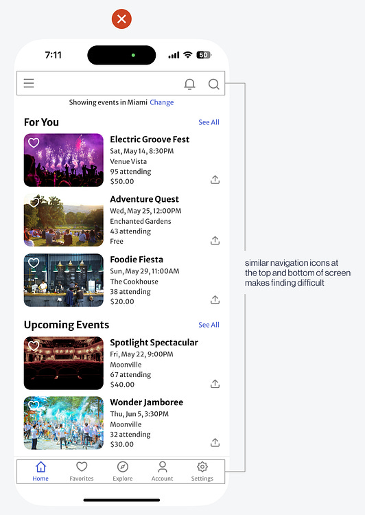
Another usability issue is the complex navigation. Notice the icons at the top corners and bottom row of the screen. Users will have trouble finding an item when you spread out the navigation like this. It creates multiple locations where they have to look to find an item. What makes it hard is that there's no differentiation between the items. It's much better to consolidate the content-level items at the bottom and personal-level items at the top. You can see the user's avatar for their account at the top right and their locale at the top left. These are all personal items users can customize.  Continue reading this post for free, courtesy of Anthony.A subscription gets you:
|
Search thousands of free JavaScript snippets that you can quickly copy and paste into your web pages. Get free JavaScript tutorials, references, code, menus, calendars, popup windows, games, and much more.
The Successful Redesign of an Awful UX (Part 3)
Subscribe to:
Post Comments (Atom)
When Bad People Make Good Art
I offer six guidelines on cancel culture ͏ ͏ ͏ ͏ ͏ ͏ ͏ ͏ ͏ ͏ ͏ ͏ ͏ ͏ ͏...
-
code.gs // 1. Enter sheet name where data is to be written below var SHEET_NAME = "Sheet1" ; // 2. Run > setup // // 3....

No comments:
Post a Comment