
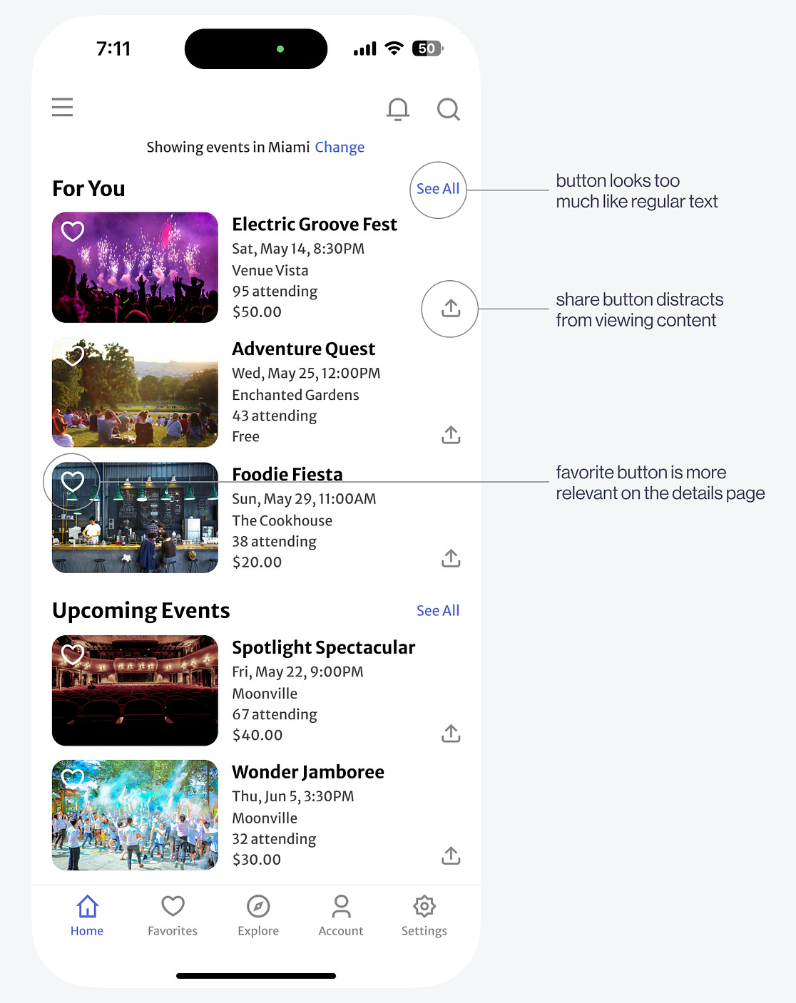
The content has three button actions: sharing, favoriting, and "See All." To get users to notice and click the "See All" button, it needs to look more interactive and less like text. Another issue with the design is that the favorite and share buttons distract users from viewing the events. While reading the information, users must also evaluate what those buttons do and decide whether to click them, increasing cognitive load.
To make the "See All" look like a button, an all-caps treatment, and a disclosure arrow icon can signify its affordance. When users perceive it, they'll interpret it to mean "view all content in this category." ...  Continue reading this post for free, courtesy of Anthony.A subscription gets you:
|
Ticker
6/recent/ticker-posts
The Successful Redesign of an Awful UX (Part 2)
May 07, 2024
Labels
- [ VISUAL STUDIO C# ] calendar USING MONTHCALENDAR
- [vuejs] game cooldown timers
- 【Android Studio】 Common Gesture
- 【ANDROID STUDIO】 Compass Shake FingerPrint sensor
- 【ANDROID STUDIO】 Create Fragment
- 【Android Studio】 External Storage File
- 【ANDROID STUDIO】 Hardware Media Controls
- 【Android Studio】 Internal Storage File
- 【ANDROID STUDIO】 Popup Menu
- 【ANDROID STUDIO】 Receive SMS
- 【ANDROID STUDIO】 Runtime Menu
- 【ANDROID STUDIO】 Send SMS
- 【ANDROID STUDIO】 Activity Switcher
- 【ANDROID STUDIO】 ActivityStarter
- 【ANDROID STUDIO】 app widget
- 【ANDROID STUDIO】 blocked call list
- 【ANDROID STUDIO】 Camera to api
- 【ANDROID STUDIO】 Card Flip
- 【ANDROID STUDIO】 circularity progress bar
- 【ANDROID STUDIO】 Compass
- 【ANDROID STUDIO】 Contextual Menu
- 【ANDROID STUDIO】 Custom View
- 【Android Studio】 CustomToast
- 【ANDROID STUDIO】 Data persistence
- 【ANDROID STUDIO】 Dial Phone number
- 【Android Studio】 direct reply notifications
- 【Android Studio】 Flashlight With notify
- 【ANDROID STUDIO】 Fragment Communication
- 【ANDROID STUDIO】 FragmentBackStack
- 【Android Studio】 Get Device Orientation
- 【ANDROID STUDIO】 Get Location
- 【ANDROID STUDIO】 getting a result from an activity
- 【ANDROID STUDIO】 How to Create Alert Dialog
- 【ANDROID STUDIO】 inflate layout
- 【ANDROID STUDIO】 is Online or Monitor connectivity status
- 【Android Studio】 List of Device Sensors
- 【ANDROID STUDIO】 Load Large Image
- 【Android Studio】 Multi touch zoom
- 【ANDROID STUDIO】 opengl creating movement
- 【ANDROID STUDIO】 opengl projection and camera
- 【ANDROID STUDIO】 opengl rotation with user interaction or input
- 【ANDROID STUDIO】 opengl setup
- 【ANDROID STUDIO】 Options Menu
- 【ANDROID STUDIO】 Phone State Listener
- 【ANDROID STUDIO】 Query Parameter Retrofit With Kotlin Coroutines
- 【Android Studio】 Reading Resource File
- 【Android Studio】 Reading Sensor Data
- 【ANDROID STUDIO】 recycler view action mode
- 【ANDROID STUDIO】 Recycler View Layout
- 【ANDROID STUDIO】 Runtime Fragment
- 【ANDROID STUDIO】 Runtime Properties
- 【ANDROID STUDIO】 Runtime Widget
- 【ANDROID STUDIO】 Save State
- 【Android Studio】 Scoped Directory Access
- 【Android Studio】 SearchView Action Bar
- 【ANDROID STUDIO】 Setup Retrofit With Kotlin Coroutines
- 【Android Studio】 shared preferences in android studio
- 【ANDROID STUDIO】 Slideshow
- 【ANDROID STUDIO】 Sound Pool
- 【ANDROID STUDIO】 Splash Screen
- 【Android Studio】 SQLite Database Loader
- 【Android Studio】 Swipe To Refresh
- 【ANDROID STUDIO】 Table View
- 【ANDROID STUDIO】 Transition Animation
- 【ANDROID STUDIO】 using the default camera app
- 【ANDROID STUDIO】 Zoom Animation
- 【ANDROID STUDIO】Activity Transition
- 【ANDROID STUDIO】Alarms
- 【ANDROID STUDIO】AsyncTask
- 【ANDROID STUDIO】Circular Activity Indicator
- 【ANDROID STUDIO】constraint layout animation
- 【ANDROID STUDIO】CRUD Room Data Persistence Library
- 【ANDROID STUDIO】Custom View
- 【ANDROID STUDIO】Fitness Tracker
- 【ANDROID STUDIO】Fling Animation
- 【ANDROID STUDIO】Frame Animation
- 【ANDROID STUDIO】Geofence
- 【ANDROID STUDIO】Google SignIn
- 【ANDROID STUDIO】Handle Google API Error
- 【ANDROID STUDIO】List Sensor Capability Service
- 【ANDROID STUDIO】Periodic Work Request Work Manager
- 【ANDROID STUDIO】Primitive View or drawer
- 【ANDROID STUDIO】Property Animation set
- 【ANDROID STUDIO】Property Animator
- 【ANDROID STUDIO】receive boot completed android
- 【ANDROID STUDIO】Recycler View Filterable
- 【ANDROID STUDIO】Room Data Persistence Library
- 【ANDROID STUDIO】Runtime Permission
- 【ANDROID STUDIO】seamless Transition Using XML
- 【ANDROID STUDIO】simple Media Player
- 【ANDROID STUDIO】Speech Recognition
- 【ANDROID STUDIO】Step Monitor Pedometer
- 【ANDROID STUDIO】Text To Speech
- 【ANDROID STUDIO】Torch Light Screen Brightness
- 【ANDROID STUDIO】Transition fade and slide
- 【ANDROID STUDIO】Transition Using code
- 【ANDROID STUDIO】Unstructured Concurrency
- 【ANDROID STUDIO】View Model With Data Binding
- 【ANDROID STUDIO】Weather Utility Compare Environmental Sensors (Temperature
- 【ANDROID STUDIO】WebView
- 【ANDROID STUDIO】Working With Interfaces Dagger
- 【C #】 WPF wave line effect
- 【C# form】 read Excel table
- 【C#】 WPF achieves 3D particle wave effect
- 【C#】implementing snowflake fractal
- 【FLUTTER ANDROID STUDIO and IOS】 api integration movie searcher app
- 【FLUTTER ANDROID STUDIO and IOS】 Chart Pie Bar Line with bubble_tab_indicator
- 【FLUTTER ANDROID STUDIO and IOS】 Cupertino ActivityIndicator
- 【FLUTTER ANDROID STUDIO and IOS】 Cupertino AlertDialog
- 【FLUTTER ANDROID STUDIO and IOS】 Cupertino Button
- 【FLUTTER ANDROID STUDIO and IOS】 Cupertino modal Popup Surface
- 【FLUTTER ANDROID STUDIO and IOS】 Cupertino Segmented Control
- 【FLUTTER ANDROID STUDIO and IOS】 Cupertino Slider
- 【FLUTTER ANDROID STUDIO and IOS】 Cupertino Switch
- 【FLUTTER ANDROID STUDIO and IOS】 Cupertino TabBar
- 【FLUTTER ANDROID STUDIO and IOS】 Cupertino TabScaffold
- 【FLUTTER ANDROID STUDIO and IOS】 Expenses App
- 【FLUTTER ANDROID STUDIO and IOS】 generator list
- 【FLUTTER ANDROID STUDIO and IOS】 map interaction navigate to markers
- 【FLUTTER ANDROID STUDIO and IOS】 productivity timer
- 【FLUTTER ANDROID STUDIO and IOS】 random english word
- 【FLUTTER ANDROID STUDIO and IOS】 SelectableText Widget
- 【FLUTTER ANDROID STUDIO and IOS】 Simple Pong game app
- 【FLUTTER ANDROID STUDIO and IOS】 SimpleDialog
- 【FLUTTER ANDROID STUDIO and IOS】 slider
- 【FLUTTER ANDROID STUDIO and IOS】 Tabbar and Tabbarview
- 【FLUTTER ANDROID STUDIO and IOS】Add
- 【FLUTTER ANDROID STUDIO and IOS】Alert Dialog
- 【FLUTTER ANDROID STUDIO and IOS】Aligning Widgets
- 【FLUTTER ANDROID STUDIO and IOS】Animating A Widget Across Screens
- 【FLUTTER ANDROID STUDIO and IOS】Appointment System with SQLite
- 【FLUTTER ANDROID STUDIO and IOS】auto route
- 【FLUTTER ANDROID STUDIO and IOS】Bar Chart
- 【FLUTTER ANDROID STUDIO and IOS】Basic Redux
- 【FLUTTER ANDROID STUDIO and IOS】basic state management
- 【FLUTTER ANDROID STUDIO and IOS】Battery
- 【FLUTTER ANDROID STUDIO and IOS】bloc design pattern
- 【FLUTTER ANDROID STUDIO and IOS】Bottom Navigation Bar
- 【FLUTTER ANDROID STUDIO and IOS】BottomSheet
- 【FLUTTER ANDROID STUDIO and IOS】Call Android Java Code
- 【FLUTTER ANDROID STUDIO and IOS】card
- 【FLUTTER ANDROID STUDIO and IOS】categorize task with icon
- 【FLUTTER ANDROID STUDIO and IOS】checked and unchecked all checkbox
- 【FLUTTER ANDROID STUDIO and IOS】chip
- 【FLUTTER ANDROID STUDIO and IOS】Circle Layer Options
- 【FLUTTER ANDROID STUDIO and IOS】circular menu
- 【FLUTTER ANDROID STUDIO and IOS】CircularProgressIndicator
- 【FLUTTER ANDROID STUDIO and IOS】Color Mixer
- 【FLUTTER ANDROID STUDIO and IOS】compute function working on background
- 【FLUTTER ANDROID STUDIO and IOS】Confetti Animation
- 【FLUTTER ANDROID STUDIO and IOS】convex bottom bar
- 【FLUTTER ANDROID STUDIO and IOS】CRUD Data Persistence Using SQLite
- 【FLUTTER ANDROID STUDIO and IOS】CRUD Streams
- 【FLUTTER ANDROID STUDIO and IOS】Cupertino ActionSheet
- 【FLUTTER ANDROID STUDIO and IOS】Cupertino PageScaffold
- 【FLUTTER ANDROID STUDIO and IOS】Cupertino Picker
- 【FLUTTER ANDROID STUDIO and IOS】Cupertino TextField
- 【FLUTTER ANDROID STUDIO and IOS】Custom Clipper
- 【FLUTTER ANDROID STUDIO and IOS】Custom Loader
- 【FLUTTER ANDROID STUDIO and IOS】Custom Radial Chart
- 【FLUTTER ANDROID STUDIO and IOS】Datatables
- 【FLUTTER ANDROID STUDIO and IOS】Datepicker
- 【FLUTTER ANDROID STUDIO and IOS】dice knock out with flare integration
- 【FLUTTER ANDROID STUDIO and IOS】Dinner Chooser
- 【FLUTTER ANDROID STUDIO and IOS】Dio Http Cache
- 【FLUTTER ANDROID STUDIO and IOS】display network image
- 【FLUTTER ANDROID STUDIO and IOS】Divider and divideTiles
- 【FLUTTER ANDROID STUDIO and IOS】Double Tap
- 【FLUTTER ANDROID STUDIO and IOS】drag and drop widget
- 【FLUTTER ANDROID STUDIO and IOS】Draw Graph
- 【FLUTTER ANDROID STUDIO and IOS】DropdownButton
- 【FLUTTER ANDROID STUDIO and IOS】expansion tile card
- 【FLUTTER ANDROID STUDIO and IOS】ExpansionPanelList
- 【FLUTTER ANDROID STUDIO and IOS】Fetch Data From The Internet
- 【FLUTTER ANDROID STUDIO and IOS】filter an array object by checking multiple values
- 【FLUTTER ANDROID STUDIO and IOS】Flat Button
- 【FLUTTER ANDROID STUDIO and IOS】Floating Action Button
- 【FLUTTER ANDROID STUDIO and IOS】Fluid Slider
- 【FLUTTER ANDROID STUDIO and IOS】form password strength validation
- 【FLUTTER ANDROID STUDIO and IOS】get user location realtime geolocation tracking with leaflets and firebase database
- 【FLUTTER ANDROID STUDIO and IOS】GETX CRUD State Management
- 【FLUTTER ANDROID STUDIO and IOS】GetX With Navigation
- 【FLUTTER ANDROID STUDIO and IOS】Global key SnackBar
- 【FLUTTER ANDROID STUDIO and IOS】Google Books API
- 【FLUTTER ANDROID STUDIO and IOS】Hive Bloc CRUD
- 【FLUTTER ANDROID STUDIO and IOS】Hive Object
- 【FLUTTER ANDROID STUDIO and IOS】Hive Object CRUD
- 【FLUTTER ANDROID STUDIO and IOS】hive Simple CRUD
- 【FLUTTER ANDROID STUDIO and IOS】IconButton
- 【FLUTTER ANDROID STUDIO and IOS】Image Cropper
- 【FLUTTER ANDROID STUDIO and IOS】image filtered widget
- 【FLUTTER ANDROID STUDIO and IOS】implicit animation opacity cross fade animation builder
- 【FLUTTER ANDROID STUDIO and IOS】json storage
- 【FLUTTER ANDROID STUDIO and IOS】leaflet map
- 【FLUTTER ANDROID STUDIO and IOS】leaflet map with flutter_map_marker_cluster
- 【FLUTTER ANDROID STUDIO and IOS】leaflet map with custom marker popup
- 【FLUTTER ANDROID STUDIO and IOS】leaflets map Geolocation and Geotagging with camera
- 【FLUTTER ANDROID STUDIO and IOS】leaflets map polyline drawing overlays on a map
- 【FLUTTER ANDROID STUDIO and IOS】LinearProgressIndicator
- 【FLUTTER ANDROID STUDIO and IOS】ListView and ListTile
- 【FLUTTER ANDROID STUDIO and IOS】Listview builder with refresh Indicator
- 【FLUTTER ANDROID STUDIO and IOS】ListView items custom filter
- 【FLUTTER ANDROID STUDIO and IOS】lottie
- 【FLUTTER ANDROID STUDIO and IOS】Measures Converter
- 【FLUTTER ANDROID STUDIO and IOS】Multiple Files For Each Screen
- 【FLUTTER ANDROID STUDIO and IOS】Navigate With Named Routes
- 【FLUTTER ANDROID STUDIO and IOS】Navigation and routing
- 【FLUTTER ANDROID STUDIO and IOS】Nesting Rows and Columns
- 【FLUTTER ANDROID STUDIO and IOS】Packing Widgets
- 【FLUTTER ANDROID STUDIO and IOS】page route transition rotation fade scale size slide animation 40 presets
- 【FLUTTER ANDROID STUDIO and IOS】panorama view
- 【FLUTTER ANDROID STUDIO and IOS】Parsin JSON In The Background
- 【FLUTTER ANDROID STUDIO and IOS】partial refresh or timer button rxdart
- 【FLUTTER ANDROID STUDIO and IOS】passcode lock screen
- 【FLUTTER ANDROID STUDIO and IOS】Permutation App
- 【FLUTTER ANDROID STUDIO and IOS】Perspective 3D
- 【FLUTTER ANDROID STUDIO and IOS】PopupMenuButton
- 【FLUTTER ANDROID STUDIO and IOS】radiobutton and checkbox
- 【FLUTTER ANDROID STUDIO and IOS】raised button
- 【FLUTTER ANDROID STUDIO and IOS】Read and write JSON data
- 【FLUTTER ANDROID STUDIO and IOS】Reading and Writing Files
- 【FLUTTER ANDROID STUDIO and IOS】real-time object detection with bounding box using tensorflow lite
- 【FLUTTER ANDROID STUDIO and IOS】Remove all multiple checked checkbox items
- 【FLUTTER ANDROID STUDIO and IOS】Return Data From A Screen
- 【FLUTTER ANDROID STUDIO and IOS】Reverse and Stop Animations
- 【FLUTTER ANDROID STUDIO and IOS】RXdart remote http
- 【FLUTTER ANDROID STUDIO and IOS】Search with BloC
- 【FLUTTER ANDROID STUDIO and IOS】Selfie app with share
- 【FLUTTER ANDROID STUDIO and IOS】Send Data To A New Screen
- 【FLUTTER ANDROID STUDIO and IOS】Shader Mask
- 【FLUTTER ANDROID STUDIO and IOS】Shared Preference Storing Key-Value Data On Disk
- 【FLUTTER ANDROID STUDIO and IOS】Simple Calculator
- 【FLUTTER ANDROID STUDIO and IOS】Sizing Widgets
- 【FLUTTER ANDROID STUDIO and IOS】sliding card
- 【FLUTTER ANDROID STUDIO and IOS】slimy card animated
- 【FLUTTER ANDROID STUDIO and IOS】Sliver AppBar
- 【FLUTTER ANDROID STUDIO and IOS】Snapshot like AR face filter
- 【FLUTTER ANDROID STUDIO and IOS】Speech Recognition
- 【FLUTTER ANDROID STUDIO and IOS】SQflite and mobx with Cache log
- 【FLUTTER ANDROID STUDIO and IOS】Sqlite CRUD
- 【FLUTTER ANDROID STUDIO and IOS】sqlite one to many relationship shopping flutter
- 【FLUTTER ANDROID STUDIO and IOS】stacked card carousel demo
- 【FLUTTER ANDROID STUDIO and IOS】Staggered Animation
- 【FLUTTER ANDROID STUDIO and IOS】Stateful Send Data To A New Screen
- 【FLUTTER ANDROID STUDIO and IOS】Stepper and Step
- 【FLUTTER ANDROID STUDIO and IOS】Stopwatch
- 【FLUTTER ANDROID STUDIO and IOS】Stream Radio
- 【FLUTTER ANDROID STUDIO and IOS】switch
- 【FLUTTER ANDROID STUDIO and IOS】textfield
- 【FLUTTER ANDROID STUDIO and IOS】time picker
- 【FLUTTER ANDROID STUDIO and IOS】Tooltip
- 【FLUTTER ANDROID STUDIO and IOS】transform widget
- 【FLUTTER ANDROID STUDIO and IOS】tutorial coach mark
- 【FLUTTER ANDROID STUDIO and IOS】Tween Animation
- 【FLUTTER ANDROID STUDIO and IOS】Typehead autocompletion textfield library
- 【FLUTTER ANDROID STUDIO and IOS】video player and chewie
- 【FLUTTER ANDROID STUDIO and IOS】wave slider
- 【FLUTTER ANDROID STUDIO and IOS】Working With WebSockets
- 【FLUTTER ANDROID STUDIO IOS】 Firebase Realtime Database CRUD Operation
- 【GAMEMAKER】 1945 game remake
- 【GAMEMAKER】 add more sprite or object instance
- 【GAMEMAKER】 Database INI
- 【GAMEMAKER】 Pixelate Image
- 【GAMEMAKER】 Rotating Mini Map
- 【GAMEMAKER】 Save colour to INI
- 【GameMaker】 change sprite color using color pallete
- 【GameMaker】 Create a particle trail when an object moves
- 【GameMaker】 Destructible Terrain
- 【GameMaker】 Distance from Object to Mouse
- 【GameMaker】 Drop the Coin physics engine
- 【GameMaker】 Duck Hunt Game Remake
- 【GameMaker】 find length and width of rectangle given perimeter
- 【GAMEMAKER】 follow player
- 【GameMaker】 Gradually rotating an object towards a target
- 【GAMEMAKER】 items that can be picked up and inventory
- 【GameMaker】 Keep Player in View
- 【GAMEMAKER】 MINER destroy sprite or object
- 【GAMEMAKER】 moon lander
- 【GAMEMAKER】 multiplication table
- 【GAMEMAKER】 RTS Selectable Troops
- 【GameMaker】 Sokoban
- 【GameMaker】 Top Down Football
- 【GameMaker】 Top Down Racing
- 【GameMaker】 Zelda Style Views
- 【GAMEMAKER】advance Radar
- 【GAMEMAKER】Bomb
- 【GAMEMAKER】boomerang
- 【GAMEMAKER】Boss Battle
- 【GAMEMAKER】Branching Dialogue
- 【GAMEMAKER】Character Selected
- 【GAMEMAKER】Dashing or running ability
- 【GAMEMAKER】Day and Night
- 【GAMEMAKER】Dual View Bomber Man Game
- 【GAMEMAKER】Frogger Game Remake
- 【GAMEMAKER】Get Color
- 【GAMEMAKER】Graphical Effect (snow rain and player foot step and ect)
- 【GAMEMAKER】Invaders
- 【GAMEMAKER】Key Mapped
- 【GAMEMAKER】Memory Puzzle
- 【GAMEMAKER】Multiple Location
- 【GAMEMAKER】Party Mechanics Changing Character
- 【GAMEMAKER】Player Directions
- 【GameMaker】Predicting the Motion of an Object using motion predict script
- 【GAMEMAKER】Quest (mini map
- 【GAMEMAKER】Random Level Generator
- 【GAMEMAKER】save and load text file
- 【GAMEMAKER】Saving
- 【GAMEMAKER】Ship Mini Game
- 【GAMEMAKER】Shop and inventory
- 【GAMEMAKER】Snake
- 【GAMEMAKER】Space Shooting Games
- 【GAMEMAKER】Spiral
- 【GAMEMAKER】Text Display
- 【GAMEMAKER】Toggle quest complete
- 【GameMaker】Torpedo
- 【GAMEMAKER】Treasure Hunting
- 【GAMEMAKER】Usable Items
- 【GAMEMAKER】Weapon control select weapon with mouse wheel
- 【Google App Script GAS】 Google Drive Picker
- 【Google App Script GAS】 Multiple Upload and e signature
- 【JAVA SWING GUI】 decimal to binary ect
- 【JAVA SWING】Binary convert
- 【JAVASCRIPT】 change order payment request api
- 【JAVASCRIPT】 dynamically table addition and deletion operations
- 【JAVASCRIPT】 native component math operations component
- 【JAVASCRIPT】2048 mini game
- 【JAVASCRIPT】canvas realizes colorful clock effect
- 【JAVASCRIPT】canvas to draw coordinates and lines
- 【JAVASCRIPT】Click on the pop-up window to pop up the login box
- 【JAVASCRIPT】draw graph an equation or graphing calculator
- 【JAVASCRIPT】Handling Discount checking out with the payment request API
- 【JAVASCRIPT】Integration Stripe checking out with the payment request API
- 【JAVASCRIPT】native component random paragraph size placeholder
- 【JAVASCRIPT】picture comparison
- 【JAVASCRIPT】regular verification password strength
- 【JAVASCRIPT】seamless carousel
- 【JAVASCRIPT】social media share native component
- 【JQUERY】 floating menu
- 【jQuery】implementation of the accordion
- 【LARAVEL and FLUTTER ANDROID STUDIO and IOS】CRUD php MySQL
- 【LARAVEL and FLUTTER ANDROID STUDIO and IOS】Ecommerce Shopping
- 【LARAVEL and FLUTTER ANDROID STUDIO and IOS】laravel passport with crud php mysql full restful
- 【Laravel api and ANDROID STUDIO retrofit】 CRUD operations (create read edit delete)
- 【LARAVEL API and ANDROID STUDIO】 Retrofit Multiple Images
- 【LARAVEL API and ANDROID STUDIO】 Retrofit Recycler View Pagination
- 【Laravel api and visual basic vb.net CRUD】newtonsoft json consume restful datagridview Crud
- 【LARAVEL PHP VUE 】 detect face within an images
- 【LARAVEL VUEJS】 redelivery system
- 【Laravel】【VUEJS】send an Delay or schedule notification date in realtime using pusher
- 【Python OPENCV】 analog clock opencv
- 【Python OPENCV】 analog clock values opencv
- 【Python OPENCV】 argparse load image
- 【Python OPENCV】 Color spaces
- 【Python OPENCV】 drawing images
- 【PYTHON OPENCV】 Face tracking using dlib frontal face detector for initialization and dlib discriminative correlation filter tracker
- 【Python OPENCV】 GRAYSCALE
- 【PYTHON OPENCV】 grayscale histogram equalization
- 【Python OPENCV】 histograms
- 【PYTHON OPENCV】 Matching contours using cv2.matchShapes() against a perfect circle
- 【Python OPENCV】 read ip camera or video
- 【Python OPENCV】 read video file all properties
- 【Python OPENCV】 read video file backwards
- 【Python OPENCV】 spot the difference
- 【Python OPENCV】 testing colors
- 【Python OPENCV】 write video file
- 【PYTHON OPENCV】Adaptive thresholding
- 【PYTHON OPENCV】all colors maps in OpenCV.py
- 【PYTHON OPENCV】Approximation methods in OpenCV contours
- 【PYTHON OPENCV】arithmetic sobel operation
- 【Python OPENCV】Arithmetic with images.py
- 【PYTHON OPENCV】Aruco camera calibration
- 【PYTHON OPENCV】aruco detect markers augmented reality
- 【python opencv】aruco detect markers square
- 【PYTHON OPENCV】Basic Operations example using TensorFlow library creating scopes
- 【PYTHON OPENCV】Bitwise operations (AND
- 【PYTHON OPENCV】blobFromImage and imagesFromBlob
- 【PYTHON OPENCV】Cartoonizing images
- 【PYTHON OPENCV】clahe_histogram_equalization
- 【PYTHON OPENCV】Color histogram equalization
- 【PYTHON OPENCV】Color histogram equalization using the HSV color space
- 【PYTHON OPENCV】color spaces in OpenCV
- 【PYTHON OPENCV】compare histograms
- 【PYTHON OPENCV】Comparing grayscale histogram equalization and CLAHE
- 【PYTHON OPENCV】Comparing how to create histograms using OpenCV
- 【PYTHON OPENCV】Contours analysis based mainly on moments
- 【PYTHON OPENCV】contours ellipses Some features based on moments are calculated
- 【PYTHON OPENCV】contours introduction
- 【PYTHON OPENCV】contours introduction 2
- 【PYTHON OPENCV】Contours shape recognition mainly based on cv2.approxPolyDP() function
- 【PYTHON OPENCV】custom colors maps in OpenCV and ploting the legend
- 【PYTHON OPENCV】custom colors maps in OpenCV providing key color points
- 【PYTHON OPENCV】Detecting facial landmarks using dlib
- 【PYTHON OPENCV】detects markers using Aruco from the webcam
- 【PYTHON OPENCV】detects markers using Aruco from the webcam and draw pose
- 【PYTHON OPENCV】dlib library to calculate the 128D descriptor to be used for face
- 【PYTHON OPENCV】Face detection using OpenCV DNN face detector feeding several images to the network
- 【PYTHON OPENCV】Face detection using OpenCV DNN face detector when feeding several images to the network and crop=True in function cv2.dnn.blobFromImages()
- 【PYTHON OPENCV】face_recognition library to calculate the 128D descriptor to be used for face recognition
- 【PYTHON OPENCV】Feature detection matching object recognition based on ORB descriptors and BF matcher
- 【PYTHON OPENCV】Feature detection with ORB keypoint detector
- 【PYTHON OPENCV】filter 2D kernels
- 【PYTHON OPENCV】generates some marker images ready to be printed using Aruco
- 【PYTHON OPENCV】geometric_image_transformations
- 【PYTHON OPENCV】Grayscale histograms using a mask
- 【PYTHON OPENCV】Handwritten digits recognition using KNN and HoG features and varying both k and the number of training/testing images
- 【PYTHON OPENCV】Handwritten digits recognition using KNN and raw pixels as features
- 【PYTHON OPENCV】Handwritten digits recognition using KNN and raw pixels as features and varying both k and the number of training/testing images
- 【PYTHON OPENCV】Handwritten digits recognition using KNN and raw pixels as features and varying both k and the number of training/testing images with pre-processing of the images
- 【PYTHON OPENCV】Handwritten digits recognition using KNN and raw pixels as features and varying keys
- 【PYTHON OPENCV】histogram custom visualization
- 【PYTHON OPENCV】histogram introduction
- 【PYTHON OPENCV】Hu moments calculation
- 【PYTHON OPENCV】Hu moments calculation and properties
- 【PYTHON OPENCV】Image classification OpenCV CNN module AlexNet and caffe pre trained models
- 【PYTHON OPENCV】Image classification OpenCV CNN module using GoogLeNet and caffe pre trained models
- 【PYTHON OPENCV】Introduction to grayscale histograms
- 【PYTHON OPENCV】introduction to k-Nearest Neighbour (k-NN) algorithm
- 【PYTHON OPENCV】introduction to Support Vector Machine (SVM) technique with OpenCV
- 【PYTHON OPENCV】Introduction to thresholding techniques
- 【PYTHON OPENCV】Introduction to thresholding types
- 【PYTHON OPENCV】K-means clustering algorithm applied to color quantization
- 【PYTHON OPENCV】K-means clustering algorithm applied to three different 'clusters' of points (k=2)
- 【PYTHON OPENCV】K-means clustering algorithm applied to three different 'clusters' of points (k=3)
- 【PYTHON OPENCV】K-means clustering algorithm applied to three different 'clusters' of points (k=4)
- 【PYTHON OPENCV】K-means clustering applied color quantization calculates the color distribution image
- 【PYTHON OPENCV】K-means clustering data visualization (introduction to k-means clustering algorithm)
- 【Python OPENCV】matplotlib mouse events
- 【PYTHON OPENCV】Morphological operations
- 【Python OPENCV】mouse drawing
- 【Python OPENCV】mouse drawing circles and text
- 【PYTHON OPENCV】Object detection OpenCV DNN module using MobileNet SSD and caffe pre trained models
- 【PYTHON OPENCV】OpenCV functionality related to contours
- 【PYTHON OPENCV】ORB descriptors and Brute-Force (BF) matcher
- 【PYTHON OPENCV】Ordering contours based on the size.py
- 【PYTHON OPENCV】Otsu's binarization algorithm
- 【PYTHON OPENCV】Otsu's thresholding filtering noise applying a Gaussian filter
- 【PYTHON OPENCV】QR code detection or scanner
- 【PYTHON OPENCV】Saving a linear regression model using SavedModelBuilder in TensorFlow
- 【PYTHON OPENCV】Skin segmentation algorithms based on different color spaces
- 【PYTHON OPENCV】smoothing techniques
- 【PYTHON OPENCV】snapchat augmented reality moustache
- 【PYTHON OPENCV】snapchat augmeted reality glasses
- 【PYTHON OPENCV】splitting_and_merging
- 【PYTHON OPENCV】Testing a linear regression model using Keras
- 【PYTHON OPENCV】Testing a linear regression model using TensorFlow
- 【Python OPENCV】text drawing
- 【Python OPENCV】text drawing bounding box
- 【Python OPENCV】text drawing fonts
- 【PYTHON OPENCV】thresholding applied to a real image
- 【PYTHON OPENCV】Thresholding color images
- 【PYTHON OPENCV】thresholding scikit image otsu
- 【PYTHON OPENCV】thresholding scikit_image techniques
- 【PYTHON OPENCV】Tracking any object using dlib discriminative correlation filter tracker
- 【PYTHON OPENCV】Training a linear regression model using TensorFlow
- 【PYTHON OPENCV】Triangle thresholding filtering noise applying a Gaussian filter
- 【PYTHON OPENCV】Understanding cv2.dnn.blobFromImages() and cv2.dnn.imagesFromBlob() in OpenCV with cropping
- 【PYTHON PYTORCH】metric auc
- 【Python】 Reading
- 【PYTHON】 reads and writes to modify the xlrd and xlwt and xlutils of Excel
- 【PYTHON】Bitcoin data analysis
- 【PYTHON】Boxplots and Boxenplots
- 【PYTHON】collect the data using a SQL query
- 【PYTHON】Loading and Saving Data with Pandas
- 【PYTHON】Mean Estimated Accuracy Naive Bayes
- 【PYTHON】metric log loss
- 【PYTHON】pickle can be used for saving and loading raw Python objects
- 【PYTHON】Read and Write using joblib library
- 【PYTHON】Sqlite3
- 【PYTHON】Word Cloud and remove punctuation
- 【Redux 】CRUD Rematch Library Create Read Update Delete
- 【Teachable Machine Flutter】 Cat and Dog Classifier
- 【Visual C sharp】 Check .NET Frameworks
- 【Visual C sharp】 Color to Grayscale
- 【VISUAL C#】Dynamic button
- 【VISUAL Csharp】Enumerate Windows
- 【VISUAL Csharp】Firewall
- 【Visual Studio Visual Csharp】HTTP Download
- 【Visual Studio Visual Csharp】Progess Bar Marquee
- 【Visual Studio Visual Csharp】Progress In Status
- 【Visual Studio Visual Csharp】Send Keystrokes To application Notepad
- 【Visual Studio Visual Csharp】Threading
- 【Visual Studio Visual Csharp】Tray Icon
- 【Visual Studio Visual VB net】Device Manager
- 【Visual Studio Visual VB net】User Account
- 【VISUAL VB NET】Delete or Clear Cookies
- 【VISUAL VB NET】Internet Properties
- 【VISUAL VB NET】Lock Screen
- 【VISUAL VB NET】open and Write a new ms word or document
- 【VISUAL VB NET】ProgressBar Marque
- 【VISUAL VB NET】Safe mode detection
- 【VISUAL VB NET】Safely Remove Hardware
- 【VISUAL VB NET】Shell About Dialog
- 【VISUAL VB NET】Source Code from URL or website
- 【VISUAL VB NET】Stored Username and Password
- 【VISUAL VB NET】System Font
- 【VISUAL VB NET】Threads
- 【VISUAL VB NET】Total Physical Memory
- 【VISUAL VB.NET】Add and Remove Programs
- 【VISUAL VB.NET】Background Worker
- 【VISUAL VB.NET】Check .NET Frameworks
- 【VISUAL VB.NET】Check Driver
- 【VISUAL VB.NET】Color Image to Gray
- 【VISUAL VB.NET】Convert to any image format
- 【VISUAL VB.NET】Country List
- 【VISUAL VB.NET】Create bitmap
- 【VISUAL VB.NET】Device Detection
- 【VISUAL VB.NET】Dialogs
- 【VISUAL VB.NET】Download file via HTTP
- 【VISUAL VB.NET】Dynamic Button
- 【VISUAL VB.NET】Folder Option Search
- 【VISUAL VB.NET】IP Address
- 【VISUAL VB.NET】Item Box Color
- 【VISUAL VB.NET】Listbox Images
- 【VISUAL VB.NET】Message Boxes
- 【VISUAL VB.NET】Regional and Language Options
- 【VISUAL VB.NET】Screen Capture
- 【VUE JS ML5 JS 】video real time object detection with bounding box javascript
- 【Vue js】 billboard
- 【Vue js】 Change the Hue of a RGB Color in javascript
- 【Vue js】 Create a select box with an image that pops up in
- 【Vue js】 Cursor Trail
- 【Vue js】 custom tooltip
- 【Vue js】 Folding recursive Menu expand and collapse state
- 【Vue js】 image coordinate color picker
- 【Vue js】 router scroll to anchor tags
- 【Vue js】 text ripple effect
- 【VUE JS】Checking out with payment request API
- 【Vue js】Cropping images with download
- 【VUE JS】Detecting an image 404 Show default image when image not found
- 【Vue js】folding menu expand and collapse example
- 【VUE JS】Simple Check out Payment Request API
- 【Vue js】simple progressive Horizontal Timeline
- 【VUE JS】Upload and Preview PDF
- 【VUE JS】WORD TYPING GAME
- 【Vue.js】 referencing an object
- 【Vue.js】 identify or classify image using mobilenet and tensorflow js
- 【Vue.js】 Implementation of file name upload with javascript
- 【Vue.js】 Preventing action drag and select
- 【VUE.JS】Automatic perspective correction OpenCV.js
- 【Vue.js】retains parameters even when the browser's back button is pressed
- 【VUE.JS】tab switch effects
- 【Vue】 custom input components
- 【Vue】 Implement a function to select images like Google Photos
- 【Vue】 Resizing local images with Native File System API javascript
- 【Vue】 web harp [WIP]
- 【Vue】custom select input component
- 【Vue】Moon or Lunar phases according to date
- 【Vue】Schema or API driven form prototype
- 【Vue】Video and canvas quotes generator
- 【VUEJS BLAZEFACE TENSORFLOW】Face Detection on the browser with Tensorflow
- 【VUEJS 】 real time classifier javascript
- 【VUEJS 】 magnifying glass effect
- 【Vuejs 3】Credit Card Number Generator
- 【VUEJS BOOTSTRAP JS】 simple student management system
- 【Vuejs Google App Script】 multiple upload base64
- 【Vuejs javascript】prohibit the browser from remembering the password
- 【VUEJS lARAVEL PHP 】 Get color information from photos(Extract colors from an image like a human would do.)
- 【VUEJS tesseract js 】 OCR that allows to convert scanned images faxes screenshots ect
- 【Vuejs】 generate random graphics javascript
- 【Vuejs】 Random roll call system
- 【Vuejs】 responsive localStorage
- 【VUEJS】 Search highlight debounce
- 【VUEJS】 shopping cart ball parabola into the animation effect
- 【Vuejs】 Using Twitter Typeahead
- 【VUEJS】 adaptation by dragging to change the width of elements
- 【Vuejs】 bind the values of parent and child components in two directions
- 【Vuejs】 book management (use directive and filter)
- 【vuejs】 bus-seat-reservation
- 【VUEJS】 CRUD browser's local cache
- 【VUEJS】 downloading after combining two pictures html2canvas javascript
- 【Vuejs】 drag and drop Image
- 【Vuejs】 export html to excel with name
- 【Vuejs】 form router
- 【VUEJS】 Highlight Words On Search using mark tag
- 【Vuejs】 HTML5 Canvas Pixelate filter Image
- 【Vuejs】 idle timer
- 【Vuejs】 implement Excel import and export methods
- 【VUEJS】 JavaScript implements random five-digit verification code
- 【VUEJS】 slide able delete function
- 【VUEJS】 verification code input interaction
- 【VUEJS】Canvas desktop pinball mini-block game
- 【VUEJS】Canvas to implement the Thunder fighter typing game
- 【VUEJS】custom multi-level single selection and multiple selection
- 【VUEJS】custom multi-select components
- 【Vuejs】Drag and Drop Text Box
- 【Vuejs】falling letter typing game
- 【VUEJS】marquee effect
- 【VUEJS】multi condition filtering
- 【Vuejs】quasar framework Virtual Scroll
- 【Vuejs】realtime geolocation tracking with leaflets and firebase database
- 【Vuejs】Response speed test tool
- 【Vuejs】search keyword highlighting
- 【Vuejs】time typeahead
- 【VUEJS】video playback speed
- 【WebGL】 Canvas Context
- 【WebGL】 Creating 3D
- 【WebGL】webxr api
- 2016 in roman numerals
- 4 digit number combination generator
- A Back-to-top component for Vue.js
- A simple recurring events calendar with VueJS
- ActivityLifecycle Android Studio
- add a prefix or suffix to a word
- add days to date excel
- add days to date java
- add days to date php
- Add Prefix and/or Suffix into Each Line
- add prefix excel
- add prefix meaning
- add prefix to words
- Add Prefix/Suffix into Line
- add subtract
- add suffix online
- adding fractions and decimals calculator
- adding fractions calculator
- adding fractions with whole numbers
- adding mixed fractions calculator
- adding subtracting fractions calculator
- addition or subtraction of fractions with different denominators
- Agents (Generic)
- Agents and Leads
- Agents Commissions
- alarm clock
- alarm clock app
- alarm clock for free
- alarm clocks
- alphabet
- and mode calculator?
- and mode review (article)
- and Range
- and Range in JavaScript
- and SQLite
- Android full screen display effect of clicking pictures
- Android Studio Immersive Mode
- angular 4 signature pad
- animate multiple images using vue
- animated progress bar on scroll
- Animating SVG with CSS
- app.listen node js
- array
- ASCII Code to Text Converter
- attedances
- audio Multiple File Upload
- auto-tab vuejs
- autocomplete css
- autocomplete html
- autocomplete jquery
- axios github
- axios post form data
- axios react
- axios tutorial
- axios vs fetch
- axios vue
- axios.get is not a function
- axios.get npm
- beautify html
- best find and replace tool
- best free wysiwyg html editor
- best online japanese course
- best way to
- best wysiwyg html editor
- binary number translator
- binary to ascii converter
- binary to english
- binary to text online
- binary translator google
- binary translator to numbers
- BLoCs
- blogger word count
- bodymovin lottie flutter lottie web example lottie preview lottie angular lottie supported features lottie player convert lottie json to gif
- bootstrap signature pad
- bootstrap survey
- bootstrap vue table filter
- Bulk Add Prefix Suffix to Keywords Tool
- bulk mac address generator
- BUSINESS-ENTITIES
- C# WPF realizes the effect of flashing background lights with the mouse
- caesar cipher
- caesar cipher calculator
- caesar cipher decoder java
- caesar cipher in c
- caesar cipher java ascii
- caesar cipher java source code
- caesar cipher java tutorial
- caesar cipher wheel
- caesar's cipher
- Calculate Mean
- calculate the median of an array with javascript
- Calculating the average/mean
- calculator
- candidates votes prototype
- Case Converter Tool for Perfectly Formatted Text
- Chain check box with Vue js
- Chain radio button with Vue
- Chain select box with Vue
- check and uncheck all checkbox using VueJs
- Check and Uncheck all checkbox using VueJs Example
- Check Uncheck All Checkbox using VueJs
- checkbox in vue js
- circle area
- circle circumference
- circle diameter
- click the object once
- clock
- clock type vuejs
- code
- code formatting - Tool to Unminify / Decompress JavaScript
- coffeecup html editor
- color pallete picker gamemaker
- colors
- combination generator excel
- components
- contest winner generator
- conversion
- Convert Case - Convert upper case to lower case
- Convert Case Online
- convert compressed css
- convert large xml to csv
- convert small letter to capital in excel
- convert to capital letters online
- convert to small caps
- convert uppercase to lowercase in c
- convert uppercase to lowercase in excel
- convert wordpress xml to csv
- convert xml to csv powershell
- cookie stuffer id-tracker
- cookies
- countdown
- counting frequency of characters in a string using javascript
- Create a standalone sticky note app using Indexed Database API 【Vue.js】
- Create a UI that can be moved easily with Vue.js and SVG
- create an http module
- css
- css - Code unminify plugin for NetBeans IDE
- CSS Beautifier
- css expand
- custom directive
- CUSTOMERS
- CUSTOMERS CONTACTS
- CUSTOMERS LEAD ACTION
- CUSTOMERS LEADS
- date and time
- date calculator between two dates
- date calculator in excel
- date calculator online
- date finder
- denormalize css
- description generator online
- Detect "vue-clickaway" when clicking outside the element
- different
- director
- Display data in tree structure in Vue.js to hide and display child nodes
- dropbox password strength
- emoji download
- emoji faces
- emoji images
- emoji png
- emojis meaning
- EMPLOYEES
- EMPLOYEES-CATEGORIES
- Encoder
- english to katakana
- es6 array range
- event.keycode == 13
- eventemitter browser
- express get params
- express get url parameters
- express js
- express js download
- express js example
- express js github
- express js tutorial
- express js use
- express js vs node js
- express js w3schools
- express query params
- express render html with data
- express router
- express router middleware
- express send file to client
- express send html file
- express sendfile with data
- express serve html
- express-validator
- facebook winner picker
- far -
- file upload
- find all occurrences of a substring in a string javascript
- find and replace online
- find and replace tool
- find least common multiple
- fix a bug with standard
- flash
- flex
- Flip Text
- Flip Wording
- format xml
- formula
- Fraction as a decimal & percent
- fraction calculator simplify
- Fraction to decimal number conversion calculator
- free
- free alarm clock
- free emojis
- free online japanese course with certificate
- free online survey
- free online surveys
- frequency of characters in a string in javascript
- froala editor
- front end Component
- gallery
- game
- gamemaker
- gamemaker blitz game
- Gamemaker Bubble Sort
- GameMaker Circular cooldown
- GameMaker Dodge the Barrels
- gamemaker Mini Golf Game
- gamemaker two separate views
- games
- gcd calculator with steps
- gcd of 18 and 24
- gcf calculator
- Generate Reverse Text
- get amount of days in month
- github nprogress
- gmat mock test
- google meta tag generator
- h1 meta tag generator
- heart emoji
- hexadecimal translator
- hiragana converter
- hiragana translator
- horizontal scroll indicator
- hours
- How can I remove extra white space in a string in JavaScript
- How can I replace a regex substring match in Javascript?
- how to add fractions with unlike denominators
- how to calculate gcd
- how to convert and conversion table
- How to create a mean
- how to edit minified css
- How to insert a new line between all dots and Capital Letter in Javascript [on hold]
- How to make an HTTP POST request in node.js
- How to make external HTTP requests with Node.js
- how to print a specific area of the web page using jquery jquery.print.js example jquery print plugin print particular div in php
- how to read binary code
- How to remove extra white spaces using javascript or jquery ...
- How to search replace with regex and keep case
- How to Use Axios as Your HTTP Client nodejsaxios github
- how to write vue plugin
- html
- html - Textarea - JavaScript | Remove line breaks and spaces from
- html - Unminifying CSS in PhpStorm
- html autocomplete from list
- html formatter
- html intersection observer
- http module
- http module in mvc
- http module npm
- HTTP PUT Request with Node.js
- httpmodule example
- Humidity
- identicon api
- identicon generator api
- identicon generator javascript
- identicon github
- identicon gravatar
- image drag and drop sorting based on js
- import eventemitter from 'events'
- indexeddb chrome extension
- indexeddb demo
- indexeddb github
- indexeddb library
- indexeddb npm
- indexeddb react
- indexeddb security
- indexeddb tutorial for beginners
- input
- instagram giveaway winner picker
- install express js on windows 10
- install http module
- internet alarm clock
- intersection observer example
- intersection observer mozilla
- intersection observer polyfill
- inventory
- Invert a color online
- invite
- japanese
- javascript
- javascript - Best way to get word frequency counts for a website
- javascript - Counting the occurrences / frequency of array
- javascript - Do a PUT request via proxy using Node JS and request
- javascript - Finding the mode of an array
- javascript - How do I use JSON in the body of an http PUT
- javascript - How to remove all line breaks from a string
- javascript - How to remove all line breaks from a string?
- javascript - How to remove line breaks and white space from
- javascript - HTTP DELETE verb in Node.JS
- javascript - HTTP GET Request in Node.js Express
- javascript - JS RegEx Find and Replace based on Group
- javascript - JS regex: replace all digits in string
- javascript - Node.js server that accepts POST requests
- javascript - Put Request using pure NodeJs
- javascript - Regex to replace multiple spaces with a single space
- javascript - RegEx: How to remove extra white spaces / line breaks
- javascript - Remove ALL white spaces from text
- javascript - Remove carriage return and space from a string
- javascript - Remove Duplicate Text in Textarea
- javascript - Remove duplicate values from JS array
- javascript - Remove line breaks from start and end of string
- javascript - remove special symbols and extra spaces and replace
- javascript - Replace all whitespace characters
- javascript - Using the PUT method with Express.js
- javascript - Word Frequency Count
- javascript - Word frequency counter
- Javascript and regex: remove space after the last word in a string
- JavaScript API QuestionPro Online Survey
- javascript array generator
- javascript array range of numbers
- javascript auto fill text field
- javascript autocomplete dropdown
- javascript autocomplete textbox
- javascript character count
- javascript cipher example
- javascript cipher function
- javascript convert hiragana to katakana
- javascript count how many times a character appears in a string
- javascript count occurrences of word in string
- javascript count string occurrences in array
- Javascript counting the frequency letters of a string
- javascript create an array range
- javascript detect touch event
- javascript deterministic random
- javascript download file automatically
- javascript emit
- javascript file download example
- javascript generate number sequence
- javascript keycode to char
- javascript like search
- javascript match
- javascript math random alternative
- javascript os
- javascript password strength
- javascript path
- javascript progress bar
- javascript pseudo random number generator
- javascript random float
- javascript random number between 1 and 10
- javascript random seed
- javascript range between two numbers
- JavaScript REGEX Match all and replace
- Javascript RegEx: find GUID in an URL and replace it
- javascript remove line breaks from textarea
- javascript remove newline from end of string
- javascript remove whitespace from textarea
- javascript replace \n with newline
- javascript replace newline with comma
- javascript sequence
- javascript simple cipher
- JavaScript statistical functions for arrays: max
- javascript string replace regex
- javascript survey builder
- javascript survey code
- javascript survey example
- javascript unique random number
- JavaScript/jQuery String Replace With Regex
- jexcel
- jquery - Javascript - How to remove all extra spacing between
- jquery - Remove Extra Spaces Before and After javascript string
- jquery keycode
- jquery print div plugin print div content using javascript with css javascript print div content only jquery print preview
- jquery signature pad demo
- jquery survey
- jquery.print.js example
- js beautify
- js canvas tetris
- js deobfuscator
- js detect touch device
- JS realizes avoiding particle escape games
- JS realizes collision detection with another element when dragging an element
- js realizes the page navigation level indication effect
- kanji to hiragana
- katakana
- katakana to hiragana
- keyboard key codes list
- keycode deprecated
- keycode java
- keycode list
- keycode table
- language meta tag generator
- laravel
- Laravel 8 expiry date management/ tracking
- laravel vue file upload
- laravel-enso/vuedatatable
- latin
- lcm calculator
- lcm calculator with work
- LEAD-STATUS
- leaflet realtime example
- leaflet realtime geojson
- leaflet realtime marker
- leaflet realtime oneachfeature
- leaflet realtime push
- leaflet realtime stop
- leaflet realtime tracking
- leaflet setstyle
- learn japanese alphabet
- learn japanese online course free
- learn japanese online reviews
- learning japanese for beginners
- least common divisor calculator
- Letter Case Converter
- letter combination generator
- like
- line break javascript
- linux - How to delete duplicates in line of text?
- loading bar css
- Loop
- Loop Countdown Timer
- Loop Timer
- lottery combination generator
- lower case to uppe
- LowerCase
- mac address generator by vendor
- mac address generator iptv
- mac address generator linux
- mac address generator python
- mac address generator software
- mac address range generator
- manual attendance vuejs
- math.random range
- Mean
- Median
- memes creator or maker vue javascript
- meta tag analyzer
- meta tag generator for blogger
- meta tag generator from url
- midrange
- min
- mini
- minutes
- Mode
- Mode and Range Calculator
- module.exports function with parameters
- moment days left
- moment how many days in a month
- momentjs days in current month
- momentjs number of days in a month
- monster hunter world character creation monster hunter world character creation female monster hunter world character classes monster hunter world character creation guide
- monster hunter world male character creation monster hunter character creation monster hunter world character creation reddit monster hunter world character sliders
- move file to the trash to delete vuejs [javascript]
- multiline Converts seconds to human readable time vue javascript
- multiline HMS to Seconds to HMS vue javascript
- multiline Seconds to Hours:Minutes:Seconds vue javascript
- multiple
- multiplying mixed fractions
- Native js generates image verification code
- Newest 'unminify' Questions
- news
- Newsagents
- node current directory
- node eventemitter
- node extend eventemitter es6
- node get absolute path
- node http get headers
- node http module
- node js error event
- node js eventemitter example
- node js eventemitter vs callback
- node js events between modules
- node js export class
- node js generate sequence
- node js handle post request
- node js https request
- node js module exports
- node js modules
- node js modules list
- node js modules tutorial
- node js os example
- node js parameter validation
- node js request object
- node js require path
- node js tutorial
- node js url parameters
- node os demo
- node os homedir
- node os review
- node path directory
- node path environment variable
- node request body
- node request handler
- node require path
- node validator example
- node.js - express PUT empty body
- node.js - Express.js get http method in controller
- node.js - How to control a PUT request with NodeJS Express
- node.js - How to make http put request with zip file in nodejs
- node.js - how to send a put request from html form in express
- node.js - Retrieve response of PUT request
- node.js - Why is my first Nodejs http PUT request working
- node.js - Word frequency count in javascript?
- node.js email validation
- node.js server side form validation
- nodejs
- nodejs eventemitter
- nodejs extend eventemitter
- nodejs get filename without extension
- nodejs http request
- nodejs require
- NOT)
- notepad word count
- npm events
- npm http
- npm init
- npm install
- npm install --save
- npm install os
- npm install windows
- npm os
- npm packages
- npm password strength
- npm tutorial
- nprogress ajax
- nprogress angular
- nprogress css
- nprogress npm
- nprogress react
- nprogress spinner
- nprogress vue
- number combination generator 5 digit
- numbers
- numpy and matplotlib
- online
- online alarm clock
- online clock
- only popup once per day using cookies vuejs
- open source html editor
- OR
- OR) between two loaded images.py
- os hostname
- Page navigation
- password complexity javascript
- password strength checker github
- path __dirname
- permutation definition
- permutation math
- permutation problems
- permutation questions
- permutation statistics
- permutation vs combination
- permutations calculator
- permutations formula
- php signature pad
- pick a winner app
- pick a winner from a list of names
- play
- polygon angle calculator
- polygon angle formula
- polygon angle sum theorem
- prefix and suffix
- prefix for line
- prefix for the word line
- Prefixes and Suffixes
- Pressure Altitude)
- print js library
- print-js npm
- print.js example
- problem
- questionaire
- questionaires
- questionnaire
- questionnaires
- Raindrops
- random combination generator
- random word combination generator
- Randomcase
- range
- raw word xml to zip word docx jszip vue javascript
- react eventemitter example
- react signature pad
- readable css
- Real Estate Agents
- real time filtered by time radio button with Vue
- real time filtered by time select box with Vue
- realtime geolocation tracking with leaflets and firebase database 【FLUTTER ANDROID STUDIO and IOS】
- regex - How can I replace newlines/line breaks with spaces
- regex - javascript find and replace a dynamic pattern
- regex - Javascript Regexp Search and Replace
- regex - Javascript replace with reference to matched group
- regex - Remove duplicate commas and extra commas at start/end
- regex - remove extra spaces in string javascript
- regex example
- regex match
- regex remove line breaks
- regex replace all
- regex tester
- relative standard deviation calculator
- remove all instances of character from string
- remove blank lines unix
- remove character from string at index
- Remove Duplicate Lines
- Remove duplicate objects from JSON file in JavaScript
- remove empty lines excel
- remove empty lines linux
- remove empty lines notepad++
- remove empty lines python
- remove empty lines regex
- remove empty lines sed
- remove first and last character from string javascript
- remove first character from string
- remove first two characters from string
- remove last character from string javascript
- remove line breaks
- remove specific character from string
- Repeat
- Repeat Countdown
- Repeat Timer
- Repeating
- Repeating Countdown
- Repeating Interval Timer
- Repeating Timer
- replace
- replace - Regex to find/remove duplicate line
- Replace multiple whitespaces with single whitespace in JavaScrip
- replace newline with space in javascript
- replace special characters
- replace text in multiple files windows command line
- replace whitespace AND newline in javascript
- res.sendfile is not a function
- retail sales commission structure
- robot meta tag generator
- romaji
- romaji to kanji
- romaji to katakana
- roman numerals 1-20
- roman numerals calculator
- roman numerals chart
- roman numerals converter date
- roman numerals list
- roman numerals tattoo
- romanization
- rot cipher decoder
- ROT-13 Cipher - ROT13 - Decoder
- Round big numbers 10000 -> 10k
- route parameters
- sales commission accounting
- sales commission formula
- sales commission percentage formula
- sales commission rates
- sales commission scheme
- sales commission structure
- sales commission structure examples
- SALUTATION CODES
- sample standard deviation calculator
- scream event in node js
- scripts
- scroll indicator animation
- scroll indicator arrow
- scrollbar css
- scrollbar in html div
- select
- sentence case
- sentence case apa
- sentence case apa referencing
- sentence case converter
- sentence case excel
- sentence case powerpoint
- shelf location system Vue
- shift cipher
- shockwave
- shopping cart
- signature pad angularjs
- signature pad jquery
- signature pad rails
- simple tool One Click Copy Emoji
- slack avatar generator
- slack identicon
- slack identicon generator
- snippet
- solved example
- Solver
- sorting - Fastest way to remove duplicate lines in very large
- spawner gamemaker
- sports
- standard deviation calculator excel
- standard deviation calculator with work
- step by step calculation
- Stopwatch
- stopwords
- string replace all
- sublime unminify
- sublimetext2 - sublime text 2 - way to unminify or beautify HTM
- substitution cipher javascript
- superman emoji
- survey example
- survey js
- survey js editor
- Talent Agencies
- tetradic color scheme online Calculates the colors of the tetradic scheme for a given color
- text combination generator
- Text to ASCII converter
- that object’s style subobject is accessed
- the hat random name picker
- Timer
- timer)
- Title And Sentence Case Converter Tool
- title case converter
- transition
- transition-group
- Translator
- transpose text with delimiter vue javascript
- Travel Agents
- Tree
- Triad color scheme
- trim specific character
- typescript eventemitter example
- typing speed test php script
- Typing Spped with WPM(word per minutes) vuejs
- typing test html code
- typing test javascript source code
- typing test php code
- typing test script
- typing test source code
- typing tutor in javascript
- un minify JS (javascript) code using visual studio?
- Underscorejs
- unicast mac address generator
- unix - How to remove duplicate lines from a file
- unlike denominators
- Unlockable Levels Select Screen
- unminify
- Unminify CSS
- Unminify CSS styles
- unminify js
- unminify js and css
- unminify php
- Update and Delete Widgets
- update npm
- upgrade mariadb under xampp
- Uppercase Lowercase Case Converter
- Uppercase or Lowercase Letters Text Tool
- uppercase to lowercase in word
- v bind style background color
- v bind style background image
- v-bind:class not working
- v-bind:value
- validation in node js
- validator github
- video
- view
- virtual alarm clock
- virtual clock
- visitor
- vue
- vue axios file upload
- vue component style
- vue conditional attribute
- vue conditional style
- vue custom plugin
- vue data table
- vue datatable
- vue document title
- vue dropzone
- vue editable table
- vue file upload example
- vue get current time
- vue good table
- vue image upload component
- vue javascript Generate Custom Color pallete
- vue javascript Complementary color online Calculates the complementary color
- vue js 2.0 file upload
- vue js calendar
- vue js form validation
- vue js header title
- vue js plugin example
- vue js plugin tutorial
- vue js realizes box drag animation effect
- vue meta title
- vue moment timezone
- vue multiline hex to cmyk javascript
- vue plugin example
- Vue realizes the touch screen drag function on the mobile terminal
- vue router
- vue router meta title
- vue router title
- vue sort table
- vue table 2 demo
- vue table component
- vue title attribute
- vue use plugin in component
- vue-data-tables
- vue-good-table
- vue-headful
- vue-router-title
- vue-smart-table
- vue-tables example
- vue-tables-2
- vue-tables-2 demo
- vue-tables-2 example
- vue-tables-2 examples
- vue-tables-2 github
- vue-tables-2 jsfiddle
- vue-tables-2 tutorial
- vue-title-switcher
- vue-upload-component
- vue-upload-component example
- Vue.js File Upload Storage
- vue.js form example
- vue.js grid
- Vue.js Multiple File Upload
- vue.js title
- vue2 table
- vue2-datepicker
- vuejs
- vuejs bootstrap datepicker
- vuejs date range picker
- vuejs datepicker
- vuejs Dynamically checks and unchecks all the checkboxes
- vuejs export html to excel
- vuejs export html to word javascript
- vuejs Minimal YouTube Thumbnail Downloader
- Vuejs mobile terminal H5 numeric keyboard component
- vuejs monochromatic-colors-generator javasccript
- vuejs plugin tutorial
- vuejs Replace any character that is not a digit or a period
- vuejs table pagination
- vuejs Unlockable Levels Select Screen
- vuejs v-if example
- vuejs wordpress like drag and drop upload
- vuejs-datepicker cdn
- vuejs-datepicker example
- vuejs-datepicker npm
- wake up
- Web Audio API Note Tone Generator
- webdev
- what are node modules
- what is sentence case in ms word
- which scroll page to the top when clicked
- word count in word
- word count on a page
- word count program
- word counter google docs
- word frequency analysis
- word frequency calculator
- word frequency chart
- word frequency counter
- word frequency counter microsoft word
- word frequency database
- Word frequency for array of key/values on javascript
- word frequency graph
- word frequency in javascript
- word frequency ranking
- word frequency search
- word search generator game vuejs
- wordpad word count
- WORKFLOW ACTIONs
- write a javascript function to get the number of occurrences of each letter in specified string.
- write a program to encrypt and decrypt using caesar cipher
- writing and displaying images
- wysiwyg editor
- wysiwyg html editor free
- wysiwyg html editor open source
- XAMARIN Bidirectional Sync
- XML syntax Validator vuejs
- xml to csv c#
- xml to csv converter download
- xml to csv java
- xml to csv php
- xml to csv python
- XOR
- xvi roman numeral converter

parsinf a csv file import JavaScript vuejs
April 14, 2018
repeating html table headers on each printed page
September 02, 2018
【Google App Script GAS】 Multiple Upload and e signature
July 12, 2021
vuejs export html to excel
July 06, 2019
Credit Card Number Generator vuejs
July 20, 2018
vuejs export html to word javascript
July 07, 2019
【ANDROID STUDIO】Step counter Monitor Pedometer
January 23, 2021
HTML5 Upload base64 Form App Script Google Sheet
April 08, 2018
Random Posts
3/random/post-list
Recent in Sports
3/à¦ূগোল%20প্রশ্ন%20ও%20উত্তর/post-list
Popular Posts
parsinf a csv file import JavaScript vuejs
April 14, 2018
repeating html table headers on each printed page
September 02, 2018
Menu Footer Widget
Copyright © - StudyNoteGuru All Right Reserved
0 Comments