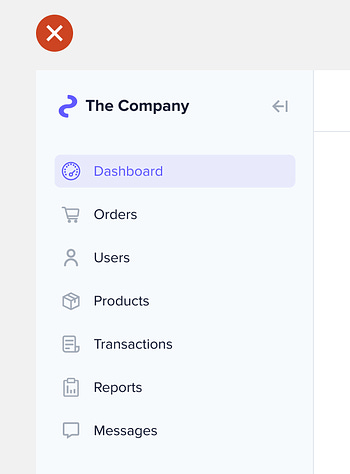
A sidebar navigation on an interface offers users multiple items to select. After making a selection, they need a visual cue to identify the chosen item. This cue is called an indicator. Every sidebar needs a clear and non-distracting selection indicator. However, many designers continue to use bad practices that make it hard for users to differentiate the chosen item. One bad practice is making the indicator too colorful. Too much color can appear distracting when the sidebar is in the user's field of view. Subscribe to UX Movement Newsletter to read the rest.Become a paying subscriber of UX Movement Newsletter to get access to this post and other subscriber-only content. A subscription gets you:
|
Search thousands of free JavaScript snippets that you can quickly copy and paste into your web pages. Get free JavaScript tutorials, references, code, menus, calendars, popup windows, games, and much more.
The Optimal Design for Sidebar Indicators
Subscribe to:
Post Comments (Atom)
When Bad People Make Good Art
I offer six guidelines on cancel culture ͏ ͏ ͏ ͏ ͏ ͏ ͏ ͏ ͏ ͏ ͏ ͏ ͏ ͏ ͏...
-
code.gs // 1. Enter sheet name where data is to be written below var SHEET_NAME = "Sheet1" ; // 2. Run > setup // // 3....

No comments:
Post a Comment