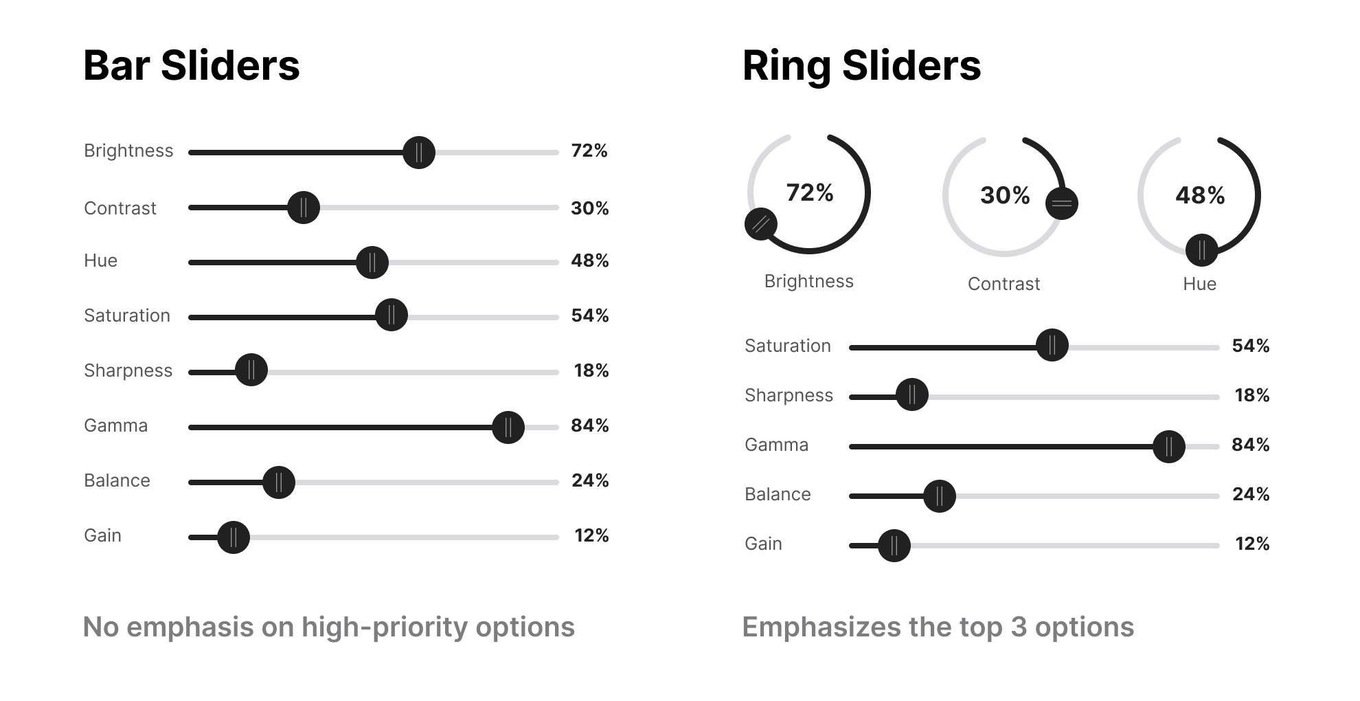
Interfaces with stacked bar sliders are hard to use. Every option looks the same, and there’s no emphasis on the high-priority ones. As a result…
| | |
| | | | Interfaces with stacked bar sliders are hard to use. Every option looks the same, and there’s no emphasis on the high-priority ones. As a result, users have to scan the entire list to adjust a specific option they want. How would you solve this issue? My idea was to turn a few of the bar sliders into ring sliders. Now, you can emphasize the top options with a visual hierarchy. The ring slider options will always stand out when users view the sliders. They display larger input values that are easy to see at a glance. The only issue I see is that it might require extra manual dexterity to maneuver the ring slider in a circle. However, you could make the input a text field that users can type in as an alternative way to change values. What are your thoughts on the use of ring sliders? |
| | |
|
| |


No comments:
Post a Comment