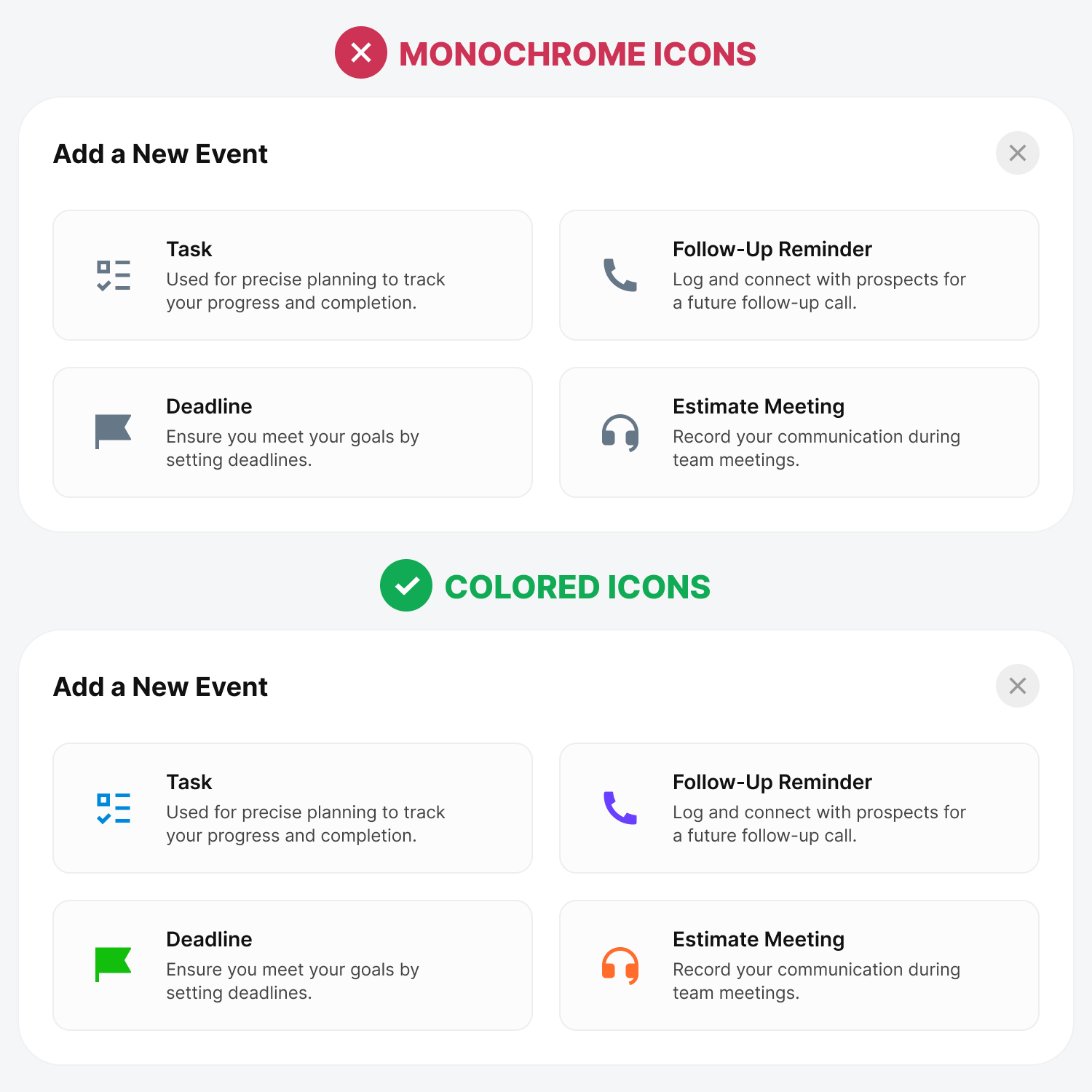
User interface icons are crucial to visual communication. You see them everywhere on websites and applications, but most have poor user experience. In other words, they're not as effective as they can be. Excellent icons should have a high visual search efficiency and favorable impression. Unfortunately, most designers don't design their icons this way. As a result, users spend more time and effort recognizing icons and are less satisfied afterward. There are right and wrong ways to use interface icons. Following these best practices will improve visual search efficiency and subjective preference for your icons. Colored vs. Monochrome IconsA study discovered that monochrome icons receive far more fixations and longer fixation times than colored icons (source). They also produce longer saccade lengths, further increasing the visual search time. Continue reading this post for free in the Substack app |
Search thousands of free JavaScript snippets that you can quickly copy and paste into your web pages. Get free JavaScript tutorials, references, code, menus, calendars, popup windows, games, and much more.
Best and Worst Interface Icon Practices
Subscribe to:
Post Comments (Atom)
Bug management that works (Part 2)
Making time for bug fixing, dedicated ‘goalies’, preventing bugs, and how to create a culture quality-focused culture which minimizes them ͏...
-
code.gs // 1. Enter sheet name where data is to be written below var SHEET_NAME = "Sheet1" ; // 2. Run > setup // // 3....


No comments:
Post a Comment